
7 Easy Fixes for Flat Watercolour Landscapes (Add Instant Depth!)
It’s always disappointing when your watercolour landscape turns out flat and a bit boring. You’ve got your paints out, you’re excited to create, but the final piece just feels like it’s missing that magic sense of three-dimensional space.
But there is good news!
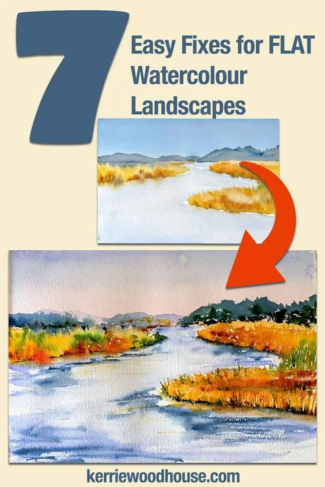
Its not your lack of style or talent… it is quite easy to put the life back into your paintings once you know what choices are available to you. With a few simple tips about colour, value, and edge control, you can take your next watercolour painting from flat to fabulous.
Wish there was a video so that you didn’t have to read all this…there is!
Check out the full video tutorial embedded below!
Let’s dive into 7 easy, practical fixes to bring your flat watercolour landscapes to life.
1. Warm Up the Horizon
Skies are blue, of course, but if you look closely at nature, there’s actually a little bit more nuance to it. It’s not the same colour blue all the way down, and there’s usually a little bit more warmth towards the horizon line.
That subtle change in colour temperature - putting something a little bit warmer right by the horizon - is incredibly effective at giving us instant depth in the sky. You could choose something in the gold family, but starting with a soft touch of pink is a beautiful option (and sometimes, you’ve just got to add things to your painting because they please you!).
The Fix: Lay down a warm colour like pink or gold near the horizon, then blend a lavender blue at the top of the painting, slowly fading it out so it meets the soft transition of the warmth below. This variety in both colour and temperature instantly adds believable depth to your sky
By the way, if you love painting skies I have a whole course on that. Skies are a huge part of the landscape! Become a confident sky painter and you will find the whole landscapes becomes a breeze to paint.

Click here to find out more about the Simple Skies in Watercolour Course
2. Anchor Your Painting with a Dark Foreground Lead-In
Now, let’s think about the bottom edge of your painting. If you’re painting water, for example, the water will ultimately get lighter and lighter as it stretches into the distance toward the horizon. But to get the viewer there, you need a nice, dark lead-in.
We want the foreground to have a bit of darkness to ground the entire composition.
The Fix: Pop a nice dark value (I chose Indigo in my painting in the video) around the base and the bottom corners of your painting. This is highly effective at leading the viewer's eye into the landscape, drawing them in naturally.
3. Push Distant Elements Back with Cool Tones
The colours you choose for things like background mountains will instantly convey a sense of distance. Because of the way light travels and the way our eyeballs process it, everything that is far away from us takes on a far more bluish cast (atmospheric perspective).
To make your background mountains look like they are very far away, they need to be the most blue and the most pale.
The Fix: Always use lovely, cool, pale tones for distant elements to push them further back into the image.
4. Use Light and Dark Values to Convey the Sense of Distance
While the most distant mountains should be pale, the mountains that are closer to us can be darker. This is where you can use one of the most wonderful characteristics of watercolour to your advantage: transparency.
Because watercolour is transparent, your top layers will let the bottom layers show through. This makes it incredibly easy to build up colour and dimension by painting layers of mountains on top of one another.
The Fix: Build your landscape up gradually in layers, making the most of the transparency property of watercolour paint. Wait for your first pale, distant mountain layer to dry perfectly, and then place a slightly darker layer right in front of it.
5. Use Less Detail for Distant Objects (Wet-into-Wet)
Choosing your level of detail is a massive secret to conveying distance. Think about a distant clump of marsh grasses or trees. Since it's much further away from us than elements in the foreground, our eyes detect less detail. To show this in paint we need to make sure it looks softer.
And watercolour is perfect for this!
When things are far away, you want to avoid trying to include to much detail, and aim for soft edges rather than hard lines or specific shapes. Instead, you want to let the watercolour do the work of suggesting the texture.
The Fix: Use more wet-into-wet techniques for background elements. Drop your greens or golds into a damp wash and let the colours blend together as they see fit without hard edges.
6. Crisp Up Your Foreground Details
To bring an object closer to the viewer, do the exact opposite of the background rule: increase the level of detail.
As your landscape comes toward the foreground, you want to think about showing a few more specific brush marks. Instead of soft, blurry edges, you want to switch tactics so the paper can capture textures.
The Fix: Use less wet on wet technique and try painting these sections on drier paper for your foreground elements. For example, if you are painting grasses sticking up from the water, use your brush to flick upward and create sharper marks. You never need to paint anything in absolute, tedious detail, but a higher level of detail will instantly pull those objects forward.
7. Ground Your Objects with Punchy Shadows
Have you ever finished a painting and felt like your trees, buildings, or grasses look like they are floating?
That happens when you leave out the dark shadows.
Even if your grass is a beautiful golden brown, there are always deep, dark shadows hidden in between the blades where the light simply cannot reach. Painting the shadows is often the most exciting part of a painting because it's exactly when you pop in those punchy darks that the entire piece starts to come to life.
The Fix: Don’t forget the lovely dark shadows! These deep values place your objects firmly in the scene, giving them a sense of dimension, anchoring them to the ground or water, and totally eliminating that flat look.
Take Your Landscape Painting Further!
Fixing a flat painting is all about looking for the balance of light and shadow, warm and cool, soft and sharp. By applying these seven tips, you'll feel your paintings gain instant depth.
If you love painting landscapes and want to dive deeper into capturing beautiful, atmospheric outdoor scenes, you will definitely enjoy my course, Cottages in Watercolour.
It breaks down the secrets to painting charming, lifelike landscapes with ease.

Are you on your own painting journey?
One of these might be useful…


Keep on reading…


