How to Create a Mood in Your Painting
How marvellous is it that looking at a picture can instantly change your mood?
You can be grumpy and tired but when you see that cute kitten photo you can’t help but smile and feel just a tiny bit better.
The reason we love art is that it stirs an emotional reaction - it makes us feel something. An image can convey so much in an instant and each of us has our own unique response.
So how do you create a mood in your painting?

I think we have a natural instinct for some of these things that create a mood in your painting and it does develop over time. But if you want to be a bit more intentional about it here are a few things you can consider to influence the mood or feeling that your painting evokes.
1.The SUBJECT Can Determine the Mood of Your Painting
Perhaps the most obvious influence on the mood of your painting is the subject matter. Some things are inherently happy, like laughing children. Paint those and your painting will most likely have a joyful vibe. Paint some dead flowers in a vase or a desolate landscape and a more sombre feel will follow.
The choice of subject matter is the first thing that will dictate the mood of your painting but there are some other more subtle things to consider which will enhance the feel of the painting.
2.PERSPECTIVE Can Alter the Mood of Your Painting
The choices we make when we place our subject in the composition can also affect the mood of the painting. For instance if we choose an extreme viewing angle the perspective can tell a lot of the story and bring a touch of drama and a feeling of space.
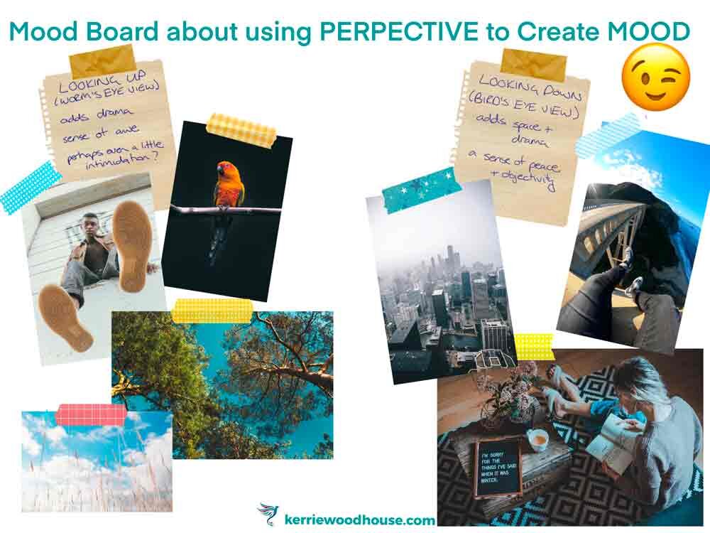
For example, when you choose a worm’s eye perspective ie viewing the subject from below the viewpoint is similar to that of a child. As a result the subject can appear to loom which may give a sense of awe or even have a slightly menacing feel.
A bird’s eye view can give a more peaceful sense - literally more perspective. It is like taking a step back, viewing everything in a more overarching context.
3.Use SHAPE LANGUAGE to Influence the Mood in Your Painting
Our brains decode the images we see without our really being aware of it. It is part of our default programming to see circular shapes as soft and welcoming, square shapes to be stable and solid and points and triangles to be exciting or even dangerous.
The shapes that are in our subject matter influence the mood in our painting because of this. Sharp jagged edges of a rocky mountain peak have a very different feel to gentle undulating curves of a riverbank.

We can also bear this in mind to emphasise the mood we are looking to create when it comes to our brushstrokes and edges.
Clean hard edges on shapes pull focus and add drama as do lively sharp brush strokes.
Flowing brushstrokes and softened edges are far more gentle and peaceful.
4.COLOUR Can Significantly Alter the Mood in a Painting
Colour certainly affects our mood. Each of us might have a slightly different reaction to various colours but here are some examples of the moods generally associated with colour:
Yellows give a positive, bright and happy feel,
Reds exude excitement, passion and energy,
Blues are calming, serene and sometimes a little sad
Purples are spiritual, rich, royal
Greens feel natural, peaceful and are associated with health
Paint a landscape in warm tones of reds and oranges and it will have a completely different feel to that same landscape in cool blues and greens. The first, perhaps at sunrise is probably energising while the the second perhaps in cool evening light might appear calm and serene.
So if your choice of subject matter is quite neutral - a food still life or a vase of flowers - you can create two completely different feeling paintings simply by changing the colour scheme.
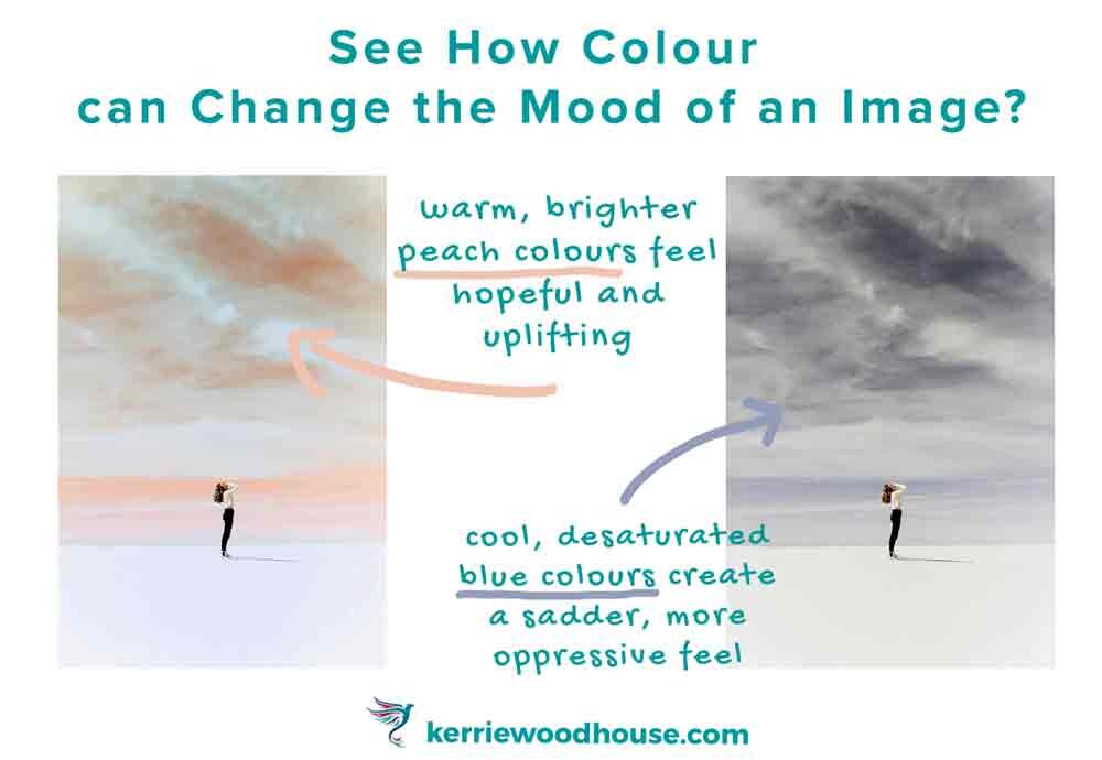
Int the image above, the lone figure looking up to the glowing peach sky seems to be having some sort of joyful revelation while the same figure in the dull grey blue version seems to be having a moment of angst and despair.
The only thing that is different in these two images is the colour palette.
5.Create Mood in Your Painting by Using SATURATION
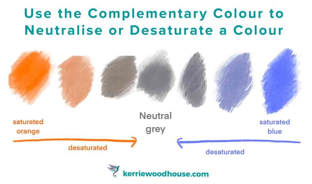
Speaking of greys, we can’t talk about the mood of colours without touching on saturation. Saturation refers to the pureness of the colour and how much grey is in it.
A pure colour or hue (for example, blue) is bright, vibrant and intense.
If you add a little of the complementary colour, the one opposite on the colour wheel, you can neutralise or desaturate the colour making it more grey.

For example: the complement of blue is orange so adding increasing amounts of orange to blue will make it seem less and less vibrant and more and more muted and grey.
Conversely, adding a little blue to orange will neutralise, mute or desaturate the blue.
Painting with highly saturated pure colour will give a bright, lively energetic feel to your painting.

Red Canna by Georgia O’Keefe uses more saturated, vibrant colour
Desaturated or neutral colours will give your painting a much more sombre, dull mood.

Still Life With Two Rabbits by Chardin uses destaturated colours
6.Enhance the Mood in Your Painting with VALUE and CONTRAST
Sometimes you hear paintings being described as high or low key. This is referring to the range of tonal values (lights and darks) used in the painting. A high key painting is mostly using light, pale colours. This gives an airy, light feel to the painting.
Here is an example or two, so that you can see what an ethereal mood this limited value range creates.

Misty Sea by Jan Toorop - Example of a High Key Painting

Waterloo Bridge by Monet - Example of a High Key Painting
A low key painting has mostly dark colours and this gives a considerably more serious, intense feel to a painting.

Tooth-Puller by Caravaggio - Example of a Low Key Painting
More drama - bold, dark and perhaps even ominous.
High contrast ie, an extreme difference between the darks and lights in a painting can add impact and drama, making a striking painting.
Isn ‘t it interesting that the words we use to describe colour are the same ones we use for mood?
Light, dark, bright… there is a reason for that.
I hope that you have found these suggestions helpful for creating a particular mood in your painting. This list is certainly not an exhaustive one - there are so many things that influence the feeling that your painting evokes.
I believe that happy painters make happy paintings…
Or is it that happy paintings make happy painters? 🤔
Either way, if painting makes you happy don’t hesitate to pick up those brushes!
It is the artist’s job to paint the little reminders of things that we feel strongly about. Surely feeling is what makes us human, without emotion we are but robots?
So paint and help the viewer feel something - even if you are the only viewer of your painting.
In fact, especially if you are the only viewer of your painting.
And if you would like to have a go at changing the mood of an image by painting along step by step with me, I have a tutorial that does exactly that.

Are you on your own painting journey?
One of these might be useful…


Keep on reading…