
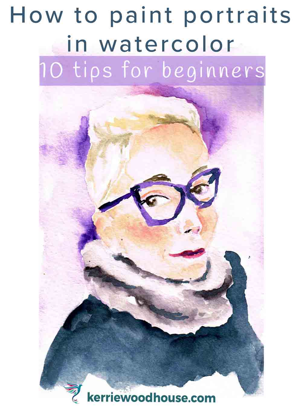
How to paint a portrait in watercolor
Painting faces is so much fun.
And so intimidating. Especially if you are new to it.
The human face is so important to us that it makes for a very meaningful subject - one that is very rewarding to paint. So let’s see what we can do about easing your path to portraiture.
Here are my top ten tips on how to paint a portrait in watercolour to get you started.
1.Aim for human looking, not a perfect likeness
When we feel a bit daunted by trying something new, it usually means we have heaped a whole lot of expectation upon ourselves. If we are painting or drawing Joan Bloggs, we want our picture to look just like Joan Bloggs.
If you are new to painting faces, that is a very tall order. And is it all that necessary? I mean wouldn’t you be happy if you painted a portrait that looked like a person, rather than being a perfect likeness of a specific person?
A good likeness is very achievable with lots of practice. All faces are constructed in basically the same way. Two eyes, a nose and mouth, always in the same order on the face, right? What makes each of us unique is the tiny nuances in particular shape and placement of each of those features.
Achieving a good likeness is dependent on the draftsmanship skill of the artist in accurately observing and transferring to the portrait the specific shapes and relative proportions of the features in a particular subject.
As a beginner, you can make your task much more approachable by aiming for a recognisably human face rather than a perfect likeness. The more approachable the task, the more portraits you are likely to paint. The more portraits you paint the better you will get at achieving a likeness. Win, win, I think…
Be kind to yourself and moderate your expectations.
2.Learn the basic proportions of the human face
As we just observed, every human face is basically the same - same features in just about the same place on every face. So one of the most helpful things you can do for yourself is to learn those basic proportions.
Once you get comfortable with knowing which features line up with each other, and how to size them relative to each other, the easier it becomes to draw a portrait. The features will always be pretty much where we expect them to be, it’s just that in the beginning we tend to make assumptions about that placement, rather than carefully observing what is actually there. For example, most beginners tend to place the eyes in the top section of the face - that’s where they go, right?
Not exactly.
In actual fact, the eyes are halfway down the face. I think it’s the hair on the top of the head that tends to throw us off. The placing and proportion of the facial features is a big enough topic for a whole extra post, so instead I have put it in a handy little guide for you.
Grab your pdf copy so that you can have it to hand on your favourite device, or print it out to have have beside you while you draw and paint.
3.Begin with a front facing face
We just spent a whole lot of time learning the the proportions of the facial features. You did get your downloadable free guide, didn’t you?
If you have a look in the mirror, or at a few photos, you will be able to see those proportions for yourself. Only, that is, when the face is facing directly forward.
As soon as the head turns a little either right or left, or up or down, those proportions appear to change. For example when a head is turned to the side, the imaginary central vertical line between the eyes no longer appears to be in the centre of the head. It appears to have shifted to one side. The side of the face that is further from the viewer is now smaller in width than the side of the face that is closest to the viewer.
Similarly, when the head tips up the imaginary horizontal line one which the eyes sit is now in the top section of the face rather than the middle.
You will be able to draw these 3/4 profile and turned heads before you know it, but for now, choose to paint a face that is looking directly at the viewer.

4.Find lots of willing references of people you don’t know
Speaking of choosing a face to paint raises another thorny issue for the portrait painter. When we paint, say, a flower, and we make a petal a bit wonky or a stem a bit fat, it’s no big deal. If we paint a loved one and make a similar mistake that is possibly less so.
None of us wants to cause offence, and the reality is that your dark-ringed-double-chinned-cross-eyed-portrait of Aunty Sue is not a depiction of how you truly see her but more a reflection of your stage in the journey to accomplished portrait painter.
Either way, best to avoid the whole issue by finding yourself a whole lot of willing portrait models that you don’t know.
Sound brilliant? It is.
It’s an app called Sktchy, on which you can find an enormous amount of photo references that people have voluntarily shared for the purpose of giving you something to draw and paint.
Download the free app and sign yourself up with a free account and start choosing your victims subjects.
5.Work small
The point of this post is to help you feel like painting portraits is something you could tackle. When it comes to making something more manageable scaling down is often the way to go.
My advice is to work small. Not business card small because that creates a different set of challenges, but a manageable sort of 5”x7” or 6”x8” sort of thing (A5 ish in my part of the world).
I painted a series of faces in one of my favourite sketchbooks. (This one, if you are wondering - affiliate link.)
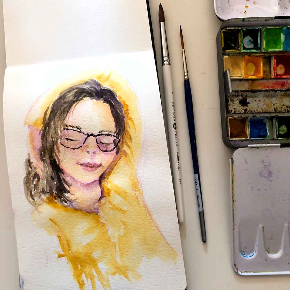
I highly recommend a sketchbook because it is another way of giving yourself permission to play rather than make a perfect finished painting for framing or some such. Just make sure that the sketchbook will take watercolour!
It also helps to try and get the size of your painting to be roughly the same size as your reference. So if you are printing out your reference photo you can scale it down to match your painting or if it is an actual photo choose to make the painting the same sort of size. If you are working with the digital version of your reference on your favourite device (that’s what I do) then you can always pinch and zoom to get the size you need.
When the reference photo and painting size match is is much easier to draw the proportions more accurately.
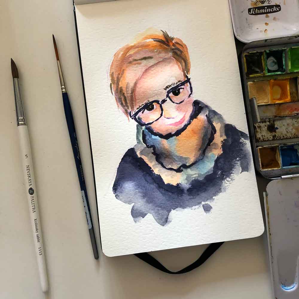
6. Sketch a basic loose outline
If you know me at all from the interwebs then you probably already know I am a fan of loose painting and drawing. That applies to portraits too. Perhaps especially to portraits. The more difficult you perceive something to be the more you tend to tighten up. That does not make for a pleasurable drawing session in my opinion and the lack of joy tends to show itself in the results too.
I would far rather see a loose, lively energetic albeit slightly wonky drawing than a torturously uptight and strained one. More importantly, it is with a glad hand and a light heart that you will be able to enjoy drawing enough to practice it more.
I suggest drawing in something like a pencil or an erasable coloured pencil (my personal preference) and starting out with loose light lines. Don’t worry about erasing every mark that you think better of and end up redoing. If at all, any extra marks can be erased just before you start painting but I suggest leaving all of them in until that time.

As you probably remember from the free guide you downloaded above (in Tip number 2) on how to draw the proportions of the human face, it is perfectly acceptable to have multiple passes over the same line. In fact I encourage it. Make them light, and feel your way in to the best version of the line you are trying to draw.
For instance don’t try and draw the perfect oval for the face first time around. Draw many light ovals continuously over each other. Then the best one reveals itself and you can erase the others (if you must).
I actually love seeing the extra light lines in a painting - especially in a sketchbook. They add so much to that loose and lively feel that I love so much. And I think they document the creation process for the page. I love that too.
7.Look for values
I think that value is much more important than colour. Don’t worry too much about trying to get the exact skin tone colour that you see in your subject. Instead focus on the value, by which I mean the dark and light passages in the reference.
The best way to see value is to close your eyes halfway or even more. When you do this the amount of information your can take in is reduced. You no longer see colour, only dark and light shapes. If you can put the dark and light sections in on the face in roughly the right places then your face will come to life.
Remember that even a black and white photograph shows what appears to be a 3D subject. This is because the darks and lights tell the viewer what the form and dimension of the subject is. And of course this is why I say that value is more important than colour.
Colour is fun of course. Don’t be afraid to put in unlikely colours that are not typical skin tones. A fun, effective contemporary portrait can be achieved with pops of greens, blues and purples in the face. As long as the value is about right, you can get away with pretty much any colour, I reckon.
Still have questions about value? It’s one of my favourite subjects so I have another post about the value scale over here which might help.
Since we are working in watercolour, remember that you can’t paint light colours over the top of dark colours. Well, you can, but they won’t look light. Since watercolour is transparent the underneath layers will show through. It is best to work from light to dark for this very reason.
Sometimes we stress about not being able to make a mistake in watercolour. I don’t really agree with that line of thinking at all. Adopt a loose approach and welcome the odd happy accident. Usually you can blot away a mark you think better of if the paint is still wet, or use the lifting technique to put a light area back in if you need to.
Don’t let any of these concerns stop you from being bold about adding the darks to contour the face. A good strong value contrast is what you need to give dimension to the face and give you a portrait with oomph as opposed to meh.
8.Avoid adding hard lines on the face
There are very few hard lines on the face. Since we are flesh covered beings most lines (wrinkles or edges) are quite soft. As soon as you start adding lines to the face you run the risk of making your subject look old, even if they are young. If you do see a line that you think is important, add it in lightly, (in a light colour) and be sure to soften the edges of your mark with a clean damp brush.
This is one of the reasons I love using watercolour for portraits. Loose wet on wet techniques can be quite helpful in capturing the softness of a face.
If in doubt, leave the lines out.

9. Less is more
The human face is a complex thing. So many muscles under the skin, so many different parts working together. Don’t let that overwhelm you. In fact, I would advise that a beginner try to forget all that and just focus on the big shapes.
Remember the very first point we started out with - aim for an impression of a person, not a perfect likeness.
Don’t try to draw every eyelash and freckle, stick to the big shapes.
When it comes to quick watercolour portraits, less is definitely more.
10. Give yourself a time limit
My final tip will actually assist in achieving the one we have just discussed - less is more. I think it is very helpful to give yourself a time limit. It is such a good way to prevent yourself from overthinking what you are doing and being too critical of yourself.
There also comes a point when the marks you add to the portrait make it worse not better. Ideally, you want to stop before that happens. If you have the slightest inkling that you might be finished you probably are. If you continue passed this point you risk losing the fresh lively quality of a loose watercolour. Better to start a new painting than risk overworking the current one. You will also learn far more from spending 1 hour making 4 paintings than 4 hours making 1 painting.
Make your goal lots of quick little portraits. And make sure you are having a lot of fun doing it. That always shows in the painting.
Want that link to that free guide again?
Here you go!