
Value drawing - why it pays to know your way around a value scale
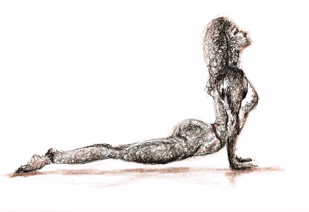
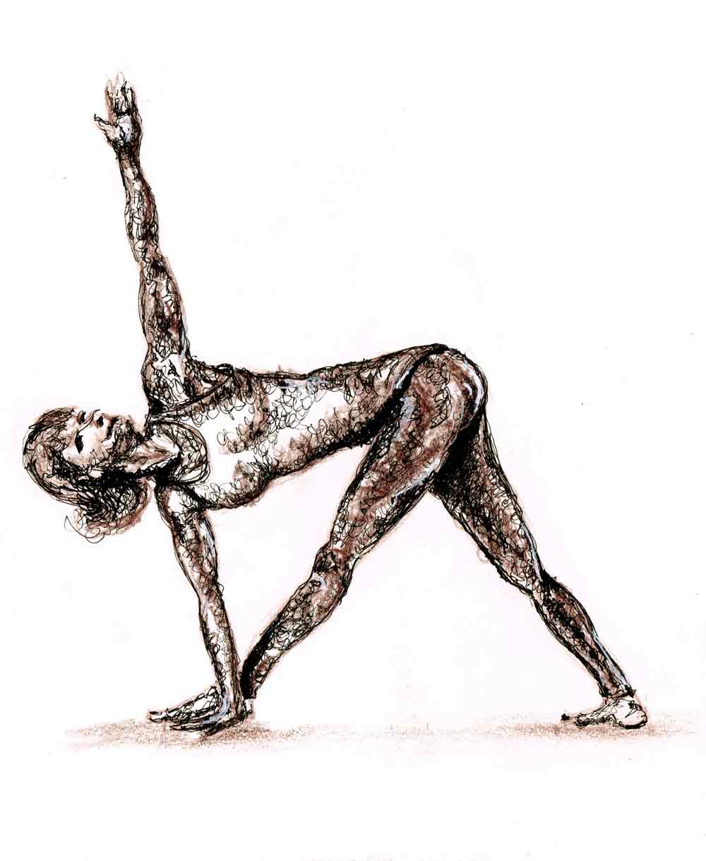
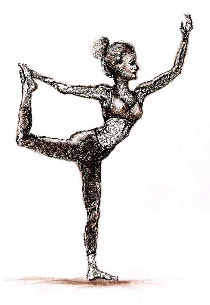
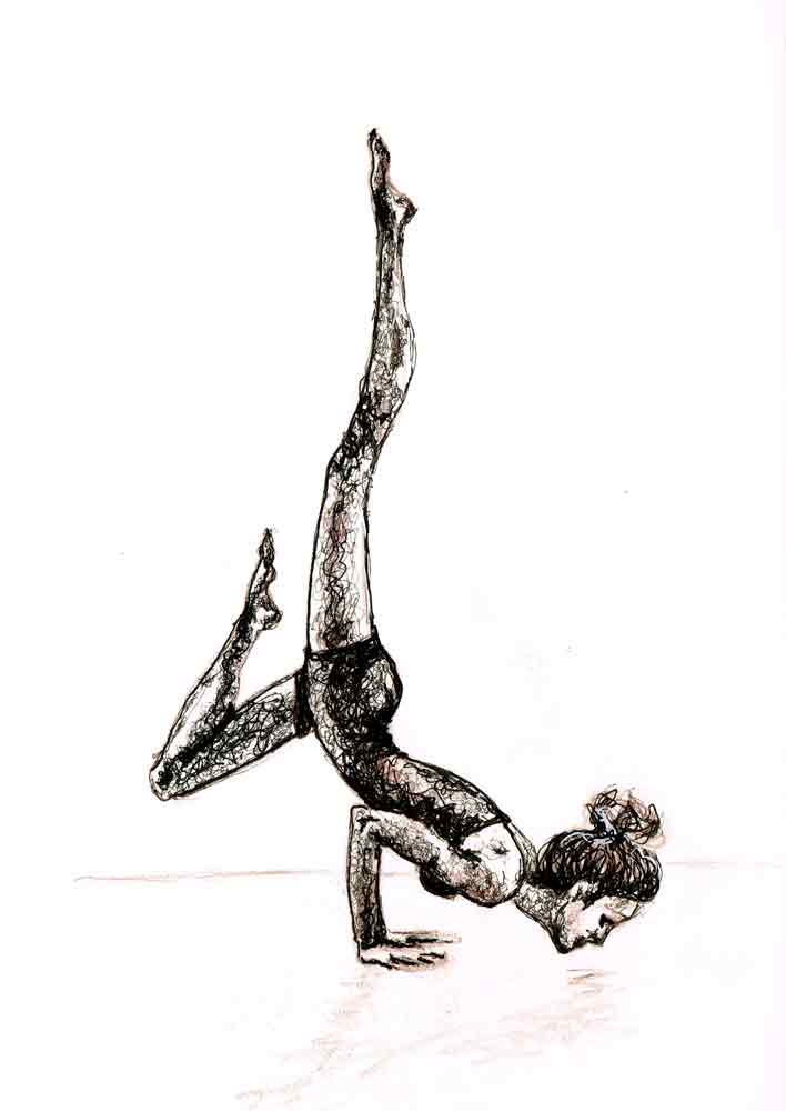

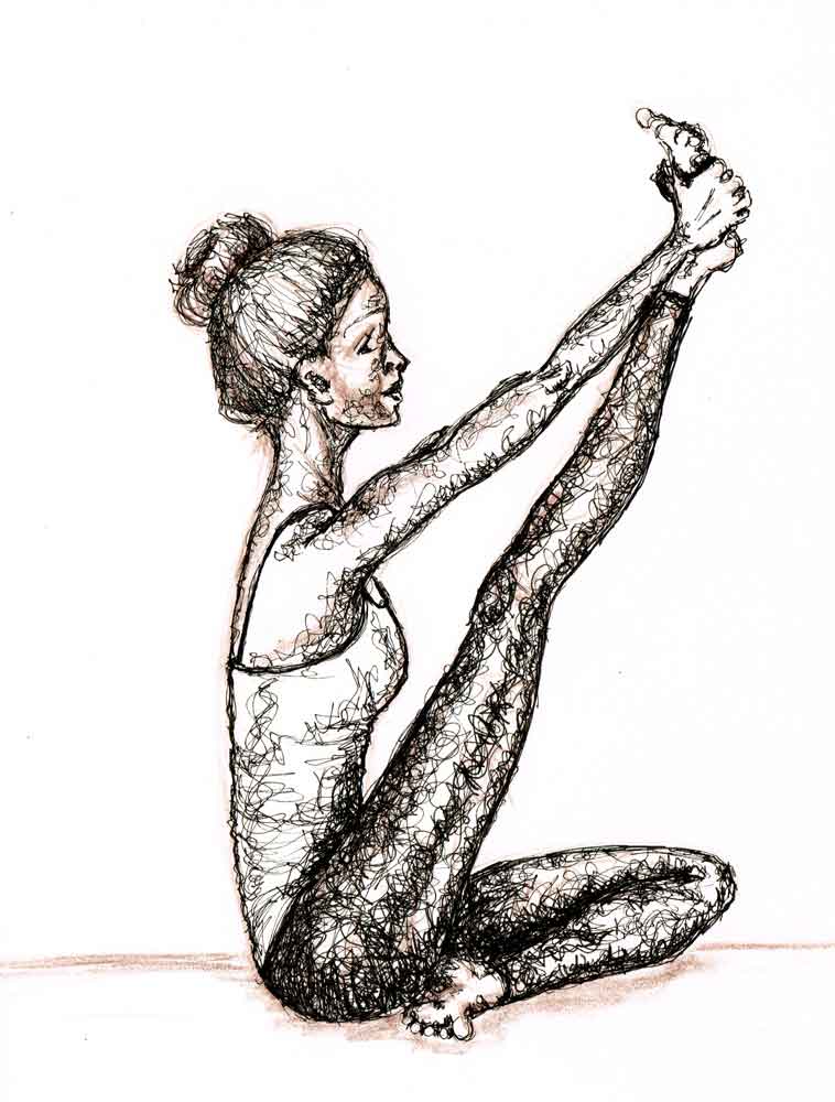
This month I have been drawing yoga poses. A great way to practice figure drawing. And since I recently took a lovely class on Scribble Art with Julie Johnson, I have also been practicing putting in my values with scribbles.

It has been a fun series to do. Quite challenging, given that it is figure drawing in fairly complicated poses, but that is why I wanted to do it in the first place. That and the chance to do some scribbly values. Because those are just fun.
Values are... well very valuable in your arty arsenal. It is the values that can bring mood to what you draw. More importantly they also indicate form, changing a flat image into something more dimensional.

One ends up doing a lot of squinting while trying to put in the values. When you squeeze your eyelids together you reduce the amount of information that your eye can take in. You are left with what is important - the values.
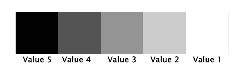
Value is the darkness or lightness of a colour. In a monochromatic image you rely mostly on value to identify what the image represents.

I am finding that it takes quite a lot of practice to be able to see all the values and replicate them in your own drawing. The advice is often to use a value scale. Something like this:
Want to try it?
Take out your smart phone and take a quick photo.
Now use your phone camera or something like the Snapseed app to change the photo into a black and white image.
See if you can pick out each of the values from the value scale in your photo. It can be deceptive. Sometimes an area looks like it is darker or lighter than it actually is because of the value that is beside it. It's one of those tricks our eyes play on us.

I put in the value using scribble, but it can be done with all sorts of techniques like shading, linework and cross-hatching. The paper is white so one of the tricks is to avoid scribbling in the areas that are going to be closest to the first value in the scale (white).
Then the finest pen you have will make a lighter value scribble, while a thicker nib pen will make a darker value scribble. The more dense the scribble is, the darker the value and the more open and lacy the scribble, the lighter the value will appear.
If you go too far you might have to get out a white pen and do a bit of white scribble to lighten up a value.
It’s all rather fun. And by the way, if you are really serious, you can use a wider value scale - 10 instead of 5.
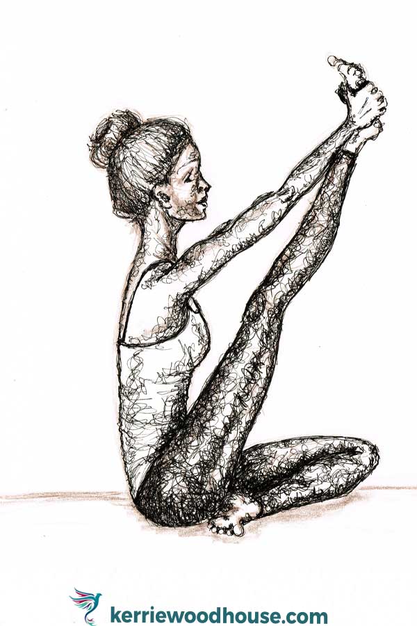
I kept my yoga values series close to being monochromatic to keep things simple. Actually I had planned to make sure it was just black pen in various nib thicknesses.
However, I don't seem to have managed to muster up sufficient restraint to keep it at that. I couldn’t help adding in a bit of coloured pencil here and there. But in the end I stuck to just the chocolate brown colerase pencil - one of my favourite things to draw with - and the pen.

Note: this post may contain affiliate links. If you end up making a purchase through one of these links it is theoretically possible that I may earn a small commission. So, thank you, if that is you!