How to Simplify a Photo for Painting
Colourful interesting scenes beg you to paint them but are often intimidatingly complex - unless you know how to simplify a photo for painting!
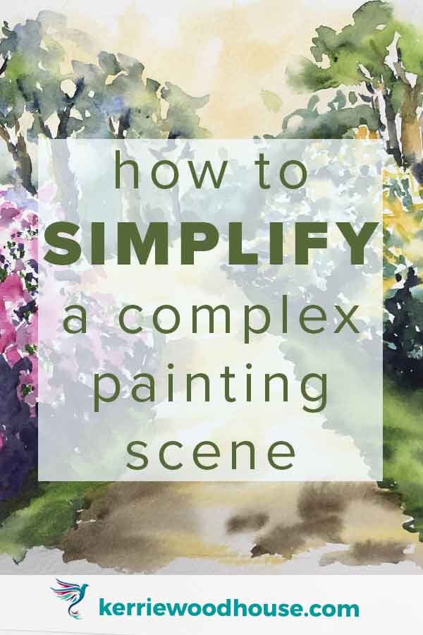
I have 3 tips to share that will have you confidently painting stunning scenes like this flower garden.
And yes - there is a video demonstration of how to apply those simplification tips to this complex painting scene.
Why Simplify the Scene Before Painting?
Gardens really are a favorite painting subject of mine I've created quite a few different garden paintings like these Garden Paths (this link will take you to the whole series).
One of the problems of painting a flower garden scene is that it's so much information to deal with at once. That's partly why we love gardens so much. They are so magnificent with all those wonderful colors and textures and layers but when it comes to creating a painting of them we can end up very easily overwhelmed!
The solution is to simplify.
I have three tips on just how to go about this simplification process. It is the process that you can see me demonstrate step by step in every one of my watercolour tutorials.
Tip 1 : Simplify the VALUES
Values are the darks and lights in an image. To see this better try half closing your eyes. This reduces the amount of information your eyes can detect- largely the colour - leaving you with more of a black and white image.
Like this.

The darks and lights are more apparent, but it is still not exactly what I would call a simple structure which is what we need.
The value pattern in the image is like a skeleton - the bones that underpin the entire painting. It needs to be strong and simple.
So if looking at the black and white version hasn’t achieved this - and I think that is the case for this image, the best option is to get out a dark marker and create a little thumbnail drawing.
This is often called a Notan sketch. It has just two values - dark and light - it can’t get simpler than that.
If a simple dark and light structure is not obvious your job is to create one by aggregating some of what you see. There is no right and wrong here and you can try out a few different options in a little thumbnail.
Here is the one I came up with.

Now that you have your skeleton you can use both the thumbnail and the reference to transfer your image to the watercolour paper. All you really need is the main lines in the composition.
This brings me to…
Tip 2 : Simplify the SHAPES
We have already done a lot of this work in the notan sketch. For example there are a lot of shapes in the more distant horizon here. The path actually curves a bit and there are lots of trees and foliage. We don’t need to draw any of that. We will suggest it with paint, but I have made the choice to aggregate those shapes into a dark mass.
I really enjoy this simplification process - it’s such a great question to ask, don’t you think?
What is really important?
What can I let go of?
How much is enough?
Oh yes, painting doesn't just teach you about painting, it teaches you about life. But I guess that is a whole other article...
I won’t try to paint individual blooms on those shrubs at all - this is another good place to simplify the shapes. I'm able to just suggest the flowers and the watercolor will do most of the work for me.
When I walk through a garden I have that lovely sense of swathes of color rushing passed me and I think watercolor does such a great job of conveying that feeling.
That's where a lot of the joy in painting comes in - from conveying the feelings of the subject rather than simply replicating its physical appearance.

The horizon line presents further room for simplifying shapes because while there are a lot of complicated branches and tree trunks in the image I just want to suggest a few of them.

Simplify the shapes on the horizon in the painting
I need some dark trunk shapes behind my bushes on the right there because that was an important part of my value pattern the only way that I can make those light yellow flowers on the top stand out is if I can put something nice and dark behind them. Those dark tree trunks are an effective dark background that pushes those yellow blooms forward.
Tip 3 : Simplify the COLOURS
It is really easy to get carried away with colour - especially with a subject like a garden. However it is usually a good idea to exercise a little restraint here.
Using a limited number of colours and repeating them throughout the painting makes for a stronger result. I have also made the choice to make the flowers on the right yellow rather than white since painting white flowers is a tiny bit more of a challenge. Not impossible, of course, but trickier perhaps than choosing to paint yellow flowers.

By the way, if you are looking for ideas on how to paint white subjects in watercolour I have an article (+ video) about painting a white dog in watercolour.
The main reason I chose yellow for these flowers is because I want a warm glow to this painting and yellow was one of the first colours I used. There is a lot of yellow in the sky and path so I am simplifying my colour scheme by using yellow for these flowers too.

I am making sure to add the darks that I planned in my little thumbnail. Value is so important. It is the pattern of dark and light in those flowering shrubs that gives them their shape and more dimensional appearance.
It is often easier to paint more from the black and white version of the reference photo than from the color version. I am not painting an exact replica of the photo. I want to be the one that chooses the colors and decides what these shrubs should look look like. So the information I need is really just the value because that is what gives the structure and dimension to the painting subject. I am free to choose whatever colours make my heart happy as long as they fall in the appropriate value range that I established in the Notan sketch.
These three tips of simplifying values, colors and shapes are really guiding principles that I use in pretty much all the paintings that I ever create.
They have helped me to feel a bit more confident and have a little bit more structure to follow, even with a loose approach to painting.
I really hope they do the same for you.
In every one of my watercolour tutorials, I show you exactly how I come up with a strategy for simplifying the particular photo reference. Then we get to apply that strategy together. I show you, step by step, exactly how I complete the painting in loose watercolour.
Want to find out more?
Check out the Watercolour Tutorial Starter Bundle by clicking below.

Are you on your own painting journey?
One of these might be useful…


Keep on reading…