
CMYK or RBY - Does it Matter to Watercolour painters?
Have you ever had a bright lively painting in mind, but when you painted it the result seemed a little dull?
Or have you tried to mix a nice modern purple only to find you end up with a sort of grey?
It’s not just you.
It could be more about whether you are working with colours based on the CMYK scheme or the RBY scheme.
Let’s figure how this might affect your watercolour painting.

What is the difference between CMYK and RBY?
Back in kindergarten we were introduced to primary colours like this.

Red Blue and yellow.
You may have colours like that in your palette now and you might have some premixed ones too like oranges, greens and purples (that are made from those traditional primaries).
Sometimes we paint in good faith using those colours, anticipating a fresh, bold outcome. But its nothing like the vibrant picture we have in our heads.
What's the solution?
If you want fresh pure colour you might want to try working with more of a CMYK scheme, instead of the more traditional RBY.
CMYK is something you might recognise from the last time you changed your printer ink. And no, its not just fancy names for Red Blue and Yellow - these are actually different colours.

In case you are wondering, the K in CMYK is for black.
Your printer needs that for printing in black and white. Funnily enough the printer uses cyan, magenta and yellow to print in greyscale, but not black. This is also why we painters know that black is not necessary. We can mix dark neutrals even without it. (More on that in a moment!)
The bright primary yellow is pretty similar in both CMY and RBY schemes.
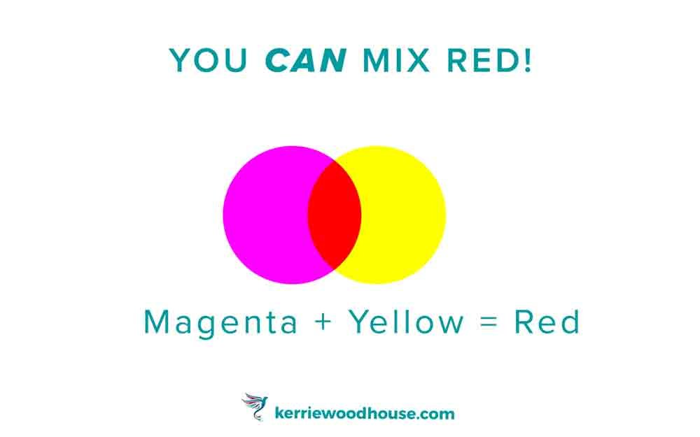
However, red and magenta are different.
Red is actually made from magenta. If you have magenta paint and you add a little drop of yellow you will find you can mix red. Yes, despite what your kindergarten teacher might have told you.
Similarly, cyan is more of a turquoise blue than the traditional primary blue.
If you take cyan paint and add a little magenta you will be able to mix the primary blue.
When you mix all three of the primaries together, you will get a dark, neutral, something approaching a dark brown, or charcoal.
If you’ve heard painters talk about mixing mud, this is what they mean.
This is the reason your mixed purples seem greyish!
If you try to mix a purple from the RBY scheme you are really mixing all 3 primaries together since we now know that red is actually magenta+yellow. No surprise then that adding blue to that makes grey.

I recently painted a series of still life scenes and thoroughly enjoyed the bold vibrance of the CMYK scheme.

Actually, this is one of the series I painted with the members of the Happy Painters’ Hub.
What Happy Painter’s Hub, you ask?
Why, this one! (click here to find out more)
Using all 3 primaries in a painting guarantees a lively effect. This is because these three colours are as different from each other as colours can be because they are evenly spaced around the colour wheel.
That means you have the highest contrast in colour which is likely to give your painting a playful, lively mood.
(If you choose an analagous scheme which is say 3 colours next to each other on the colour wheel you have a much more subtle, probably calmer feel.)

The graphic above shows the Red, Blue and Yellow evenly spaced on the colour wheel in a triadic colour scheme. Any 3 colours evenly spaced on the wheel would also obviously be considered a triad too, such as orange, purple and green, for example.
Using a CMY palette offers maximum vibrancy for even more of a bright, bold effect.
So much fun to paint!
You can’t possibly be in a bad mood after you’ve splashed a bit of turquoise, hot pink and bright yellow watercolour about!
Try it and see.
Are you on your own painting journey?
One of these might be useful…


Keep on reading…


