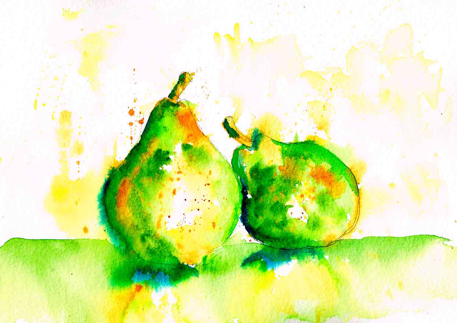
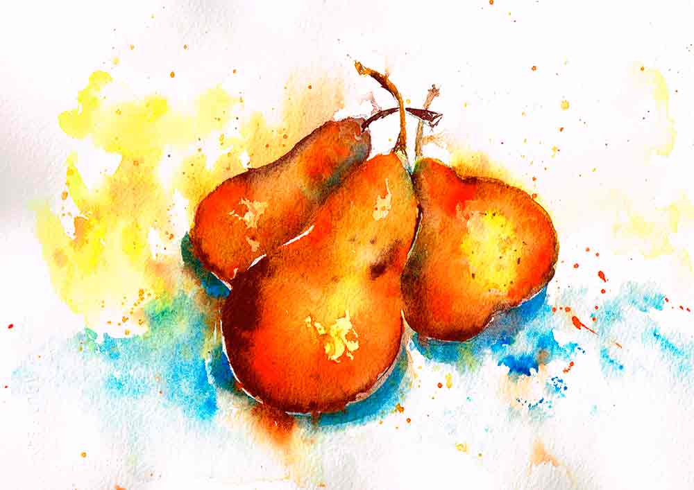
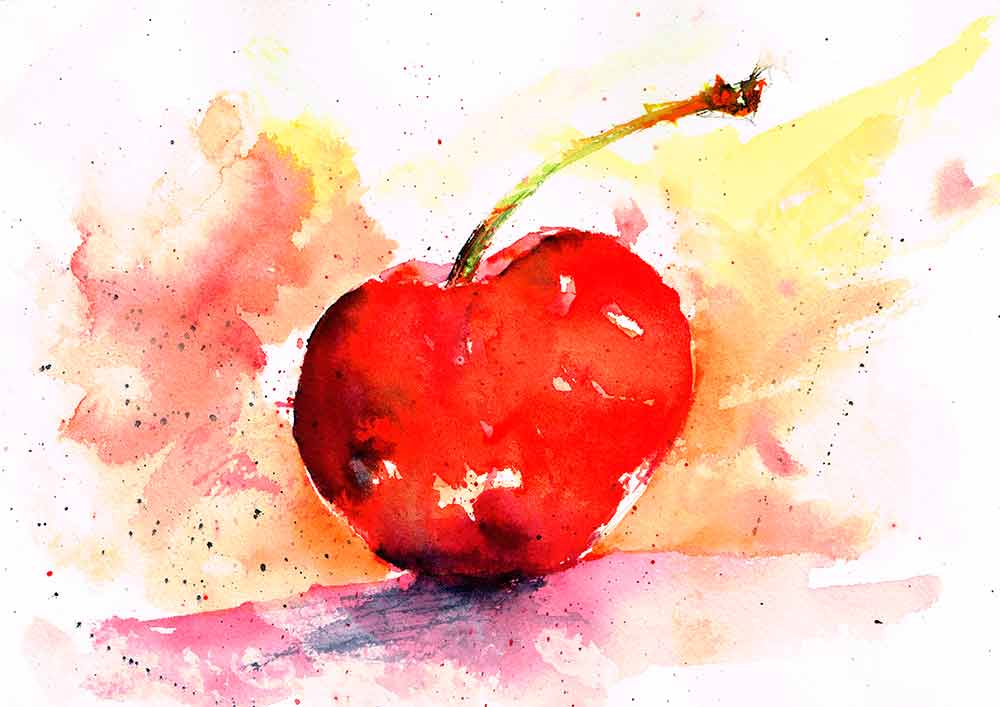
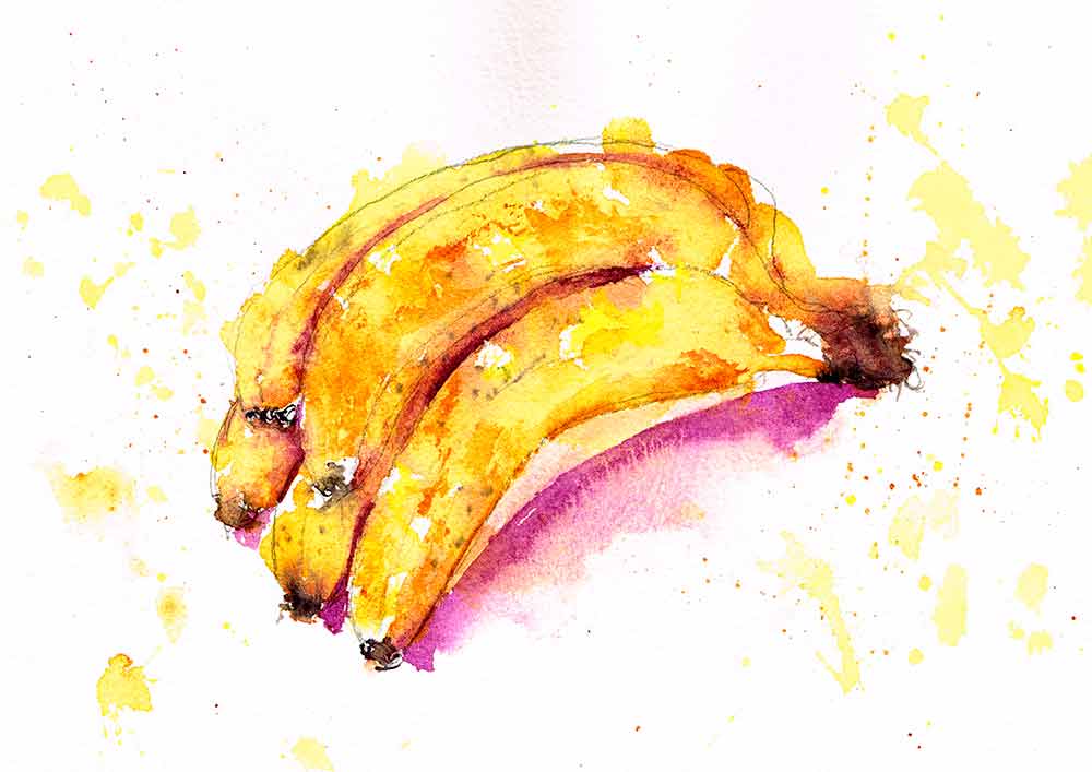
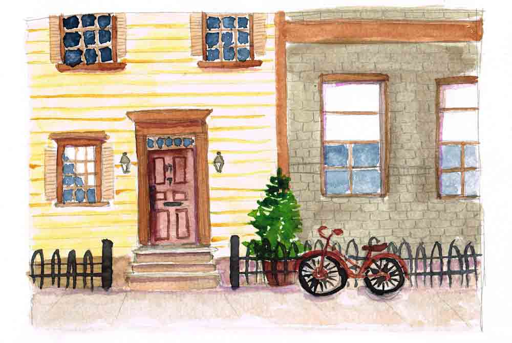
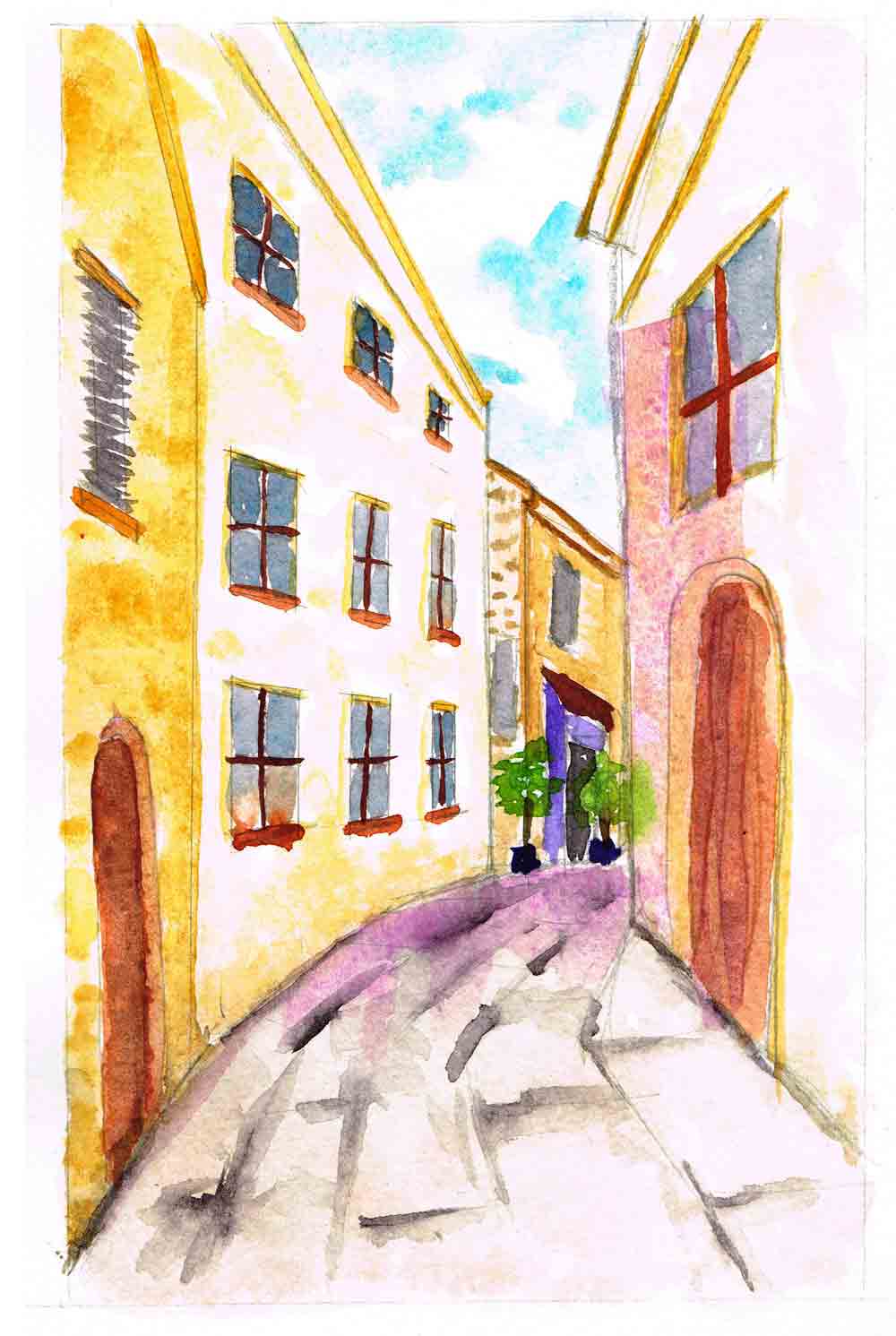
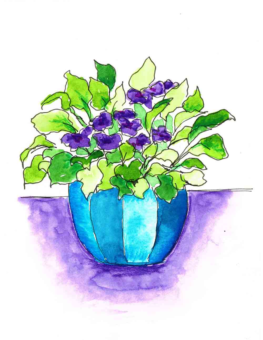
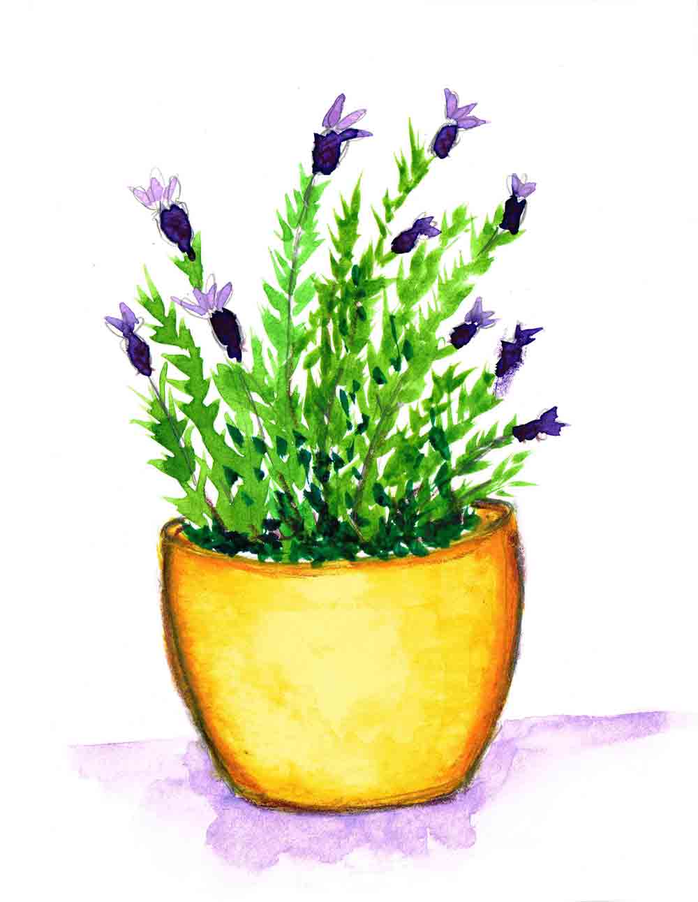
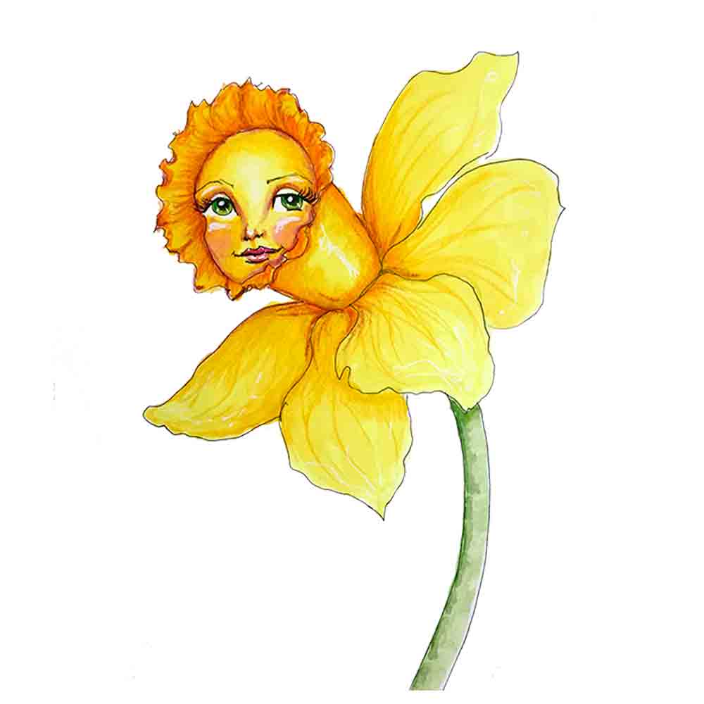
world watercolour month arttally
Woo hoo - it's World Watercolour Month!
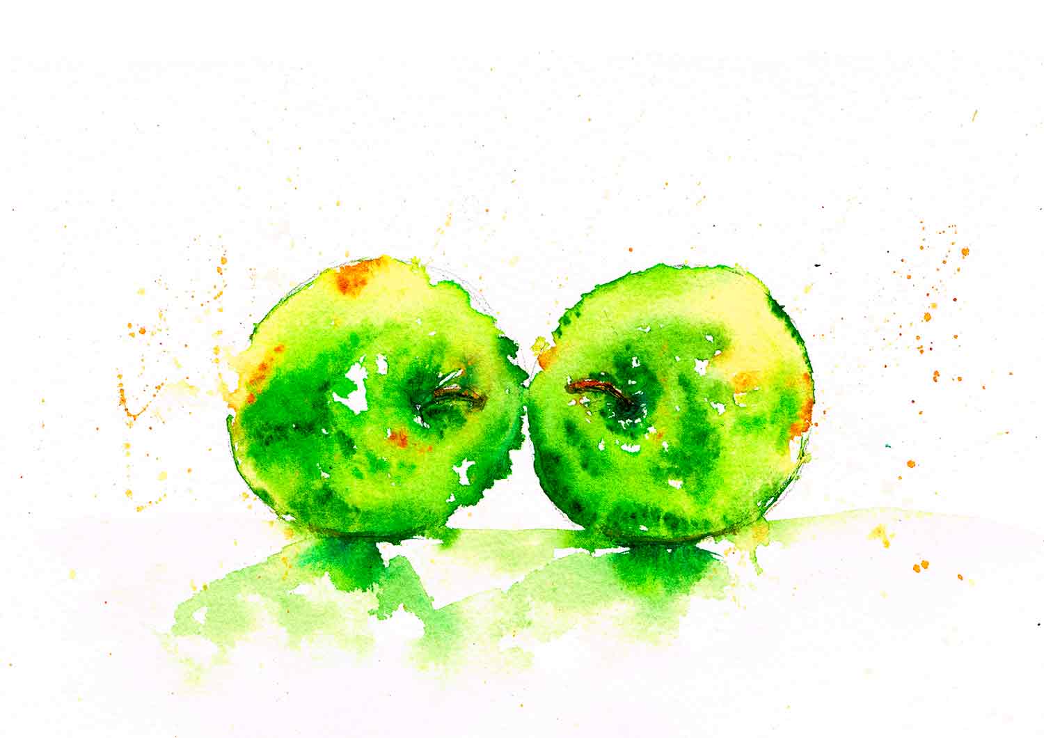
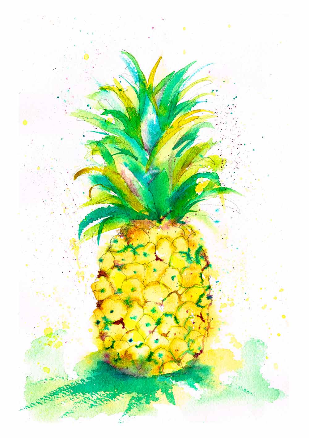
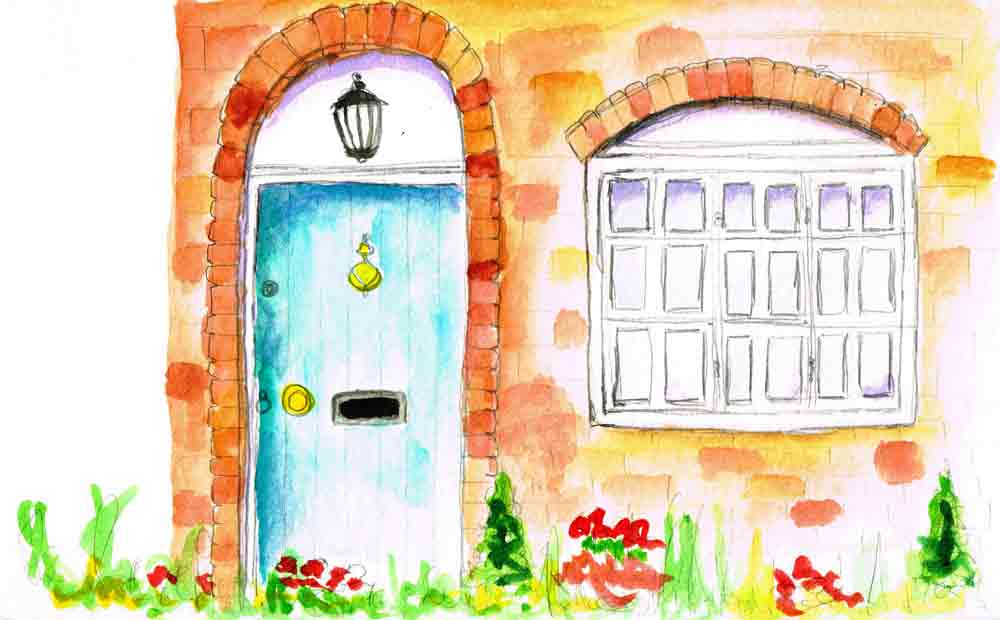
For me, pretty much every month is watercolour month, but starting this year July is World Watercolour Month.
In honour of the official theme I did consider dropping the monthly series just for this month and opening up the subject matter to a whole world of possibility. But it turns out that I am a creature of habit. Also I could end up paralysed by indecision and thus not painting at all. That would not do....
So I am sticking with tradition and going with the theme of Farm Animals for July. I can't help but want to paint in the loose wet in wet style I grew to love last month. But at the moment I am taking another of Miriam Schulman's classes entitled Farm Animal Spirits. It was very interesting to me to see how both Miriam's influences and Andrew Geeson's interacted in the painting process.
This is the way an individual style develops according to conventional wisdom. Each of us draws on aspects of every teacher, book, and environment that we discover. By melding these individual elements that resonate with us we end up with our own, very personal, unique blend. A perfect reflection of our own world and how we relate to it.
The first in my series for this month is the little lambs from Miriam's class. Aww... lambs are cute...

world watercolour month
World Watercolour Month is all about celebrating the glorious medium of watercolour. There is also a good cause to get involved in. The Dreaming Zebra Foundation and Doodlewash have teamed up to support children and young adults to explore their creativity.
There are many ways to get involved - even just supporting a watercolour artist is a fine way to celebrate. You are reading this so you can tick that box already... and thank you!
Even better you could get out some watercolour paints and make a painting some time this month. For the very keen the ultimate challenge is to complete 31 watercolour paintings in July. Normally I'm totally up for that sort of thing but it is school holidays, so we will just have to see what we can do. Whether you do 1 or 131 paintings, don't forget to share them with #worldwatercolormonth to join in the fun.