If you are anything like me you have a box of watercolour paint and you can't resist splashing a bit into your sketchbook. This gets you thinking about 'proper' watercolour painting. Is sketchbook paper good enough?
Yes and no. It really ….
Whimsical Watercolour
If you are anything like me you have a box of watercolour paint and you can't resist splashing a bit into your sketchbook. This gets you thinking about 'proper' watercolour painting. Is sketchbook paper good enough?
Yes and no. It really ….
Eventually every artist seems to draw or paint fruit.
Have you noticed that?
So it seems hard to call yourself an artist if you haven't brought the fruit bowl to your art table. To that end I decided to have a go at fruit this month in watercolour.
I have decided to take a very loose wet in wet approach. This is so very much more achievable for me, I think, as opposed to attempting some proper sort of botanical style, or classical still life. Maybe next month. Or the month after.

Watching people painting is almost as soothing as painting oneself. Actually ... in some instances it may even be better. You don't have to lift a finger and every painting turns out brilliantly.... It's painting for tired people. But please don't let that stop you getting out the paints and experiencing the tactile delights of watercolour for yourself!
I start with a rough pencil drawing. I decided to use rough paper for a change this month. As the name suggests it has a rougher texture which creates more opportunities for interesting effects created by the watercolour falling into the little hollows. On my 300gsm rough Arches watercolour paper I sketched out three pears with pencil.

wet into wet watercolour painting fruit
The next bit is fun! Using clean water and a big brush splash water about, here and there leaving spaces. I think the idea is not to think too much about it, but I must confess this can be a bit tricky. I couldn't help but worry about putting water on the bits I wanted to stay as highlights. I suppose this is how one puts the stress back into a freeing process... It's a journey... I'll get there eventually...

wet into wet watercolour painting fruit
Time for colour. I chose to paint some red pears. So I splashed in some Lemon Yellow, then my favourite Schminke Translucent Orange and Scarlet Red. Where the water is across the pencil sketch the paint flows and runs. It's delightful to watch. You have to try it.

wet into wet watercolour painting fruit
The burst of colour is joyful, but we can do even better - with shadows.
I chose Ultramarine blue and Schminke Brilliant Blue Violet. I am trying to let the brush and the water do most of the work, but it requires some restraint not to interfere. Initially I couldn't help trying to make brush strokes that go in the direction of the pear shape. This is a good thing in the ordinary course of events, but I learned towards the end of the painting that it is better to press a confident brush mark into the paper and then leave it, rather than dragging the brush around too much.
If you do that you end up with more hard edges and unnatural looking shapes. Of course you can soften hard edges with clean water, but a more efficient way is to use the expressive brush mark and not fiddle too much. Another consequence of fiddling is that you miss out of the beautiful effects of the colours blending cleaning into one another by themselves. If you drag your brush though them you can end up mixing them rather muddily. (Is that a word?)

wet into wet watercolour painting fruit
I let this stage dry and then went back in with a smaller brush to add a few details. And of course a few details soon become a few more. Before long you can't help wondering if you shouldn't have stopped painting and not added any further details at all.
Knowing when to walk away is something I will be working on this month, I am sure. Can't wait....

Won't you get out your paints and join me?

Looking for affordable watercolour paints that deliver professional results? Aren’t we all!
I just received a Meilang set of 36 Watercolour Tubes to review. I’ve been very curious to see how they compare to my existing palette of paints from renowned brands.
I want to know whether investing in expensive paints is truly necessary and I’m hoping to find some substitutes for beloved colours within this affordable set of watercolours.
You too? Well let’s dive in then!
Do we really need to be constantly pushing ourselves outside our comfort zone?
I really don't think so. Watercolour painting has given me the perfect opportunity to play with this idea of comfort zones. What applies to painting applies to life, it seems.
Ever want to paint but just feel too….
tired,
under the weather,
busy?
One of the reasons I chose watercolour as a medium in the first place is because it requires very little in the way of supplies, set up and clean up. Even so, there are times when I simply can’t be asked to get off the couch, painting urges notwithstanding.
I’d say that happens to all of us.
Either way, what’s a busy painter to do?
How about this…
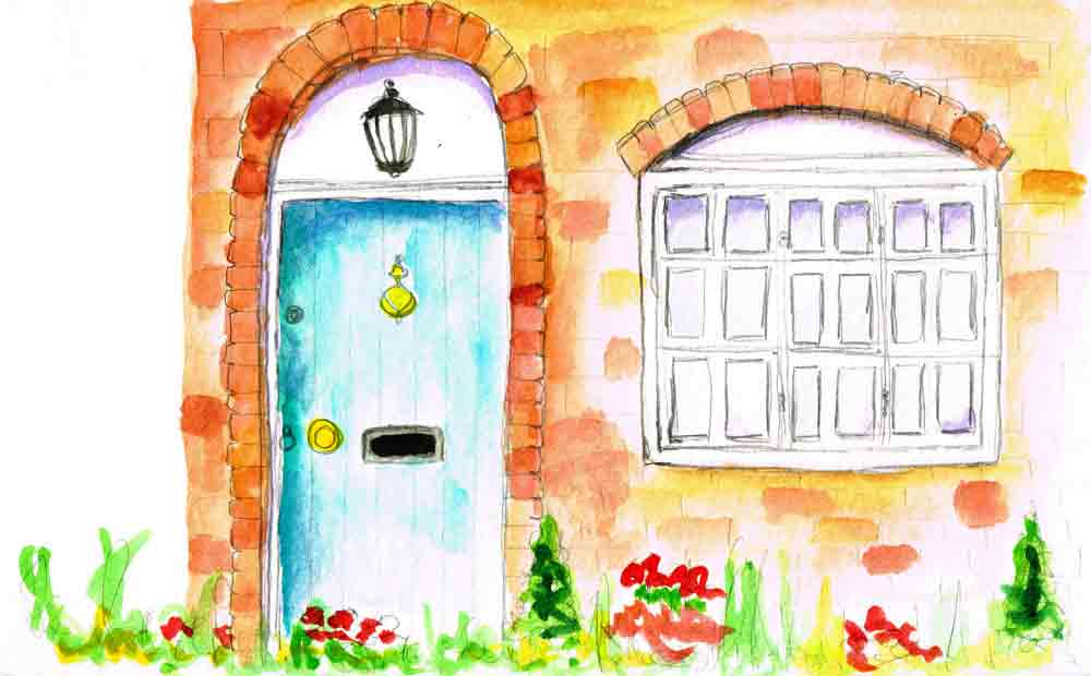
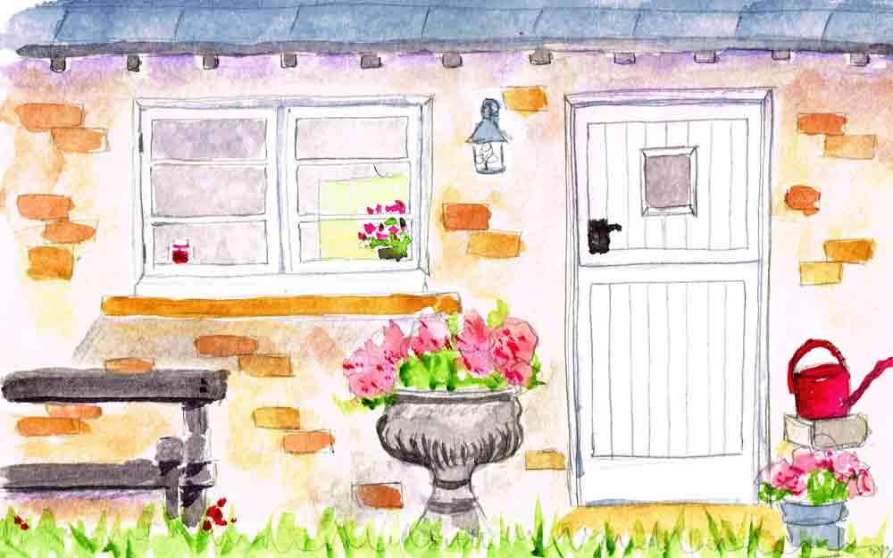
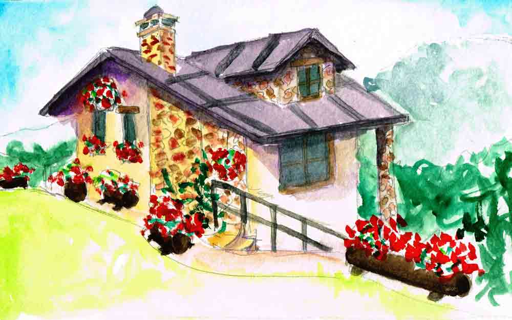

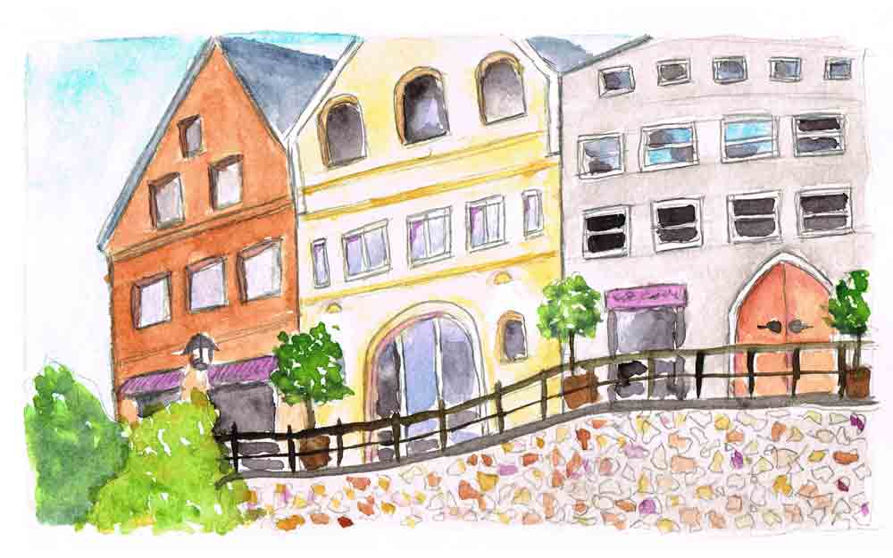
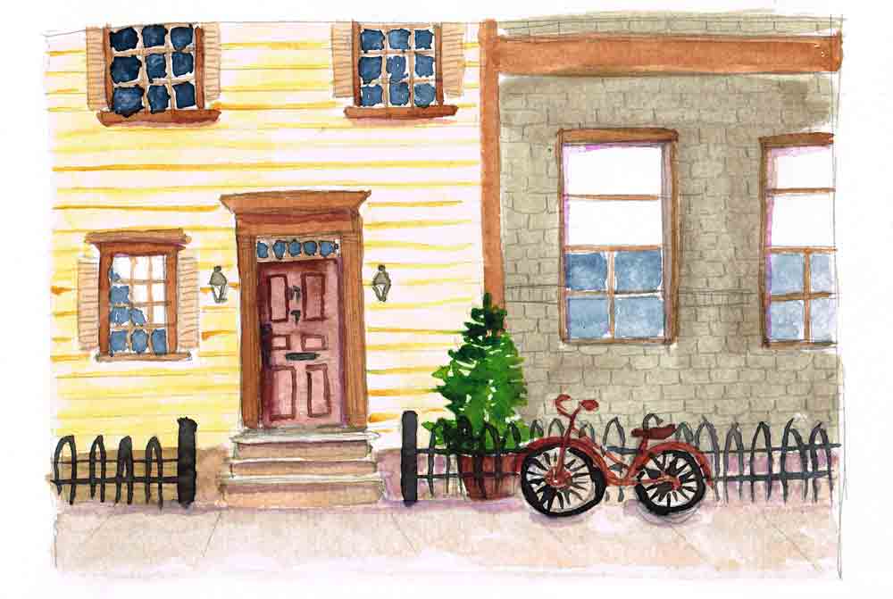
I decided to sketch buildings this month because I had noticed a trend towards drawing a single subject with no background or context. Sketching a building and the street in which it sits seemed a nice way to get my head back into composing a whole picture. It also ended up being something of a vicarious house hunting trip. I mean, I could live here, couldn't you?

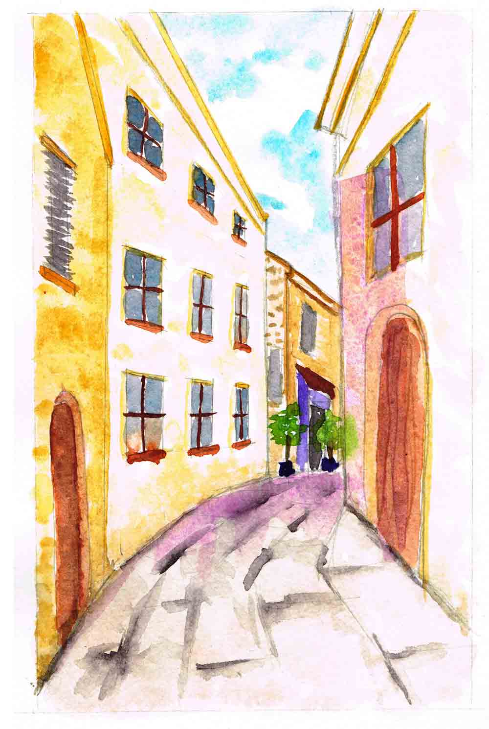
Actually that seems like an idyllic place for a weekend break, I think. Perhaps something a little more urban, for everyday living... like this...

I would pop down to this little street for a bit of shopping in a heartbeat. I can't help but think there must be a lovely little restaurant behind that arched window... wonder what's on the menu...

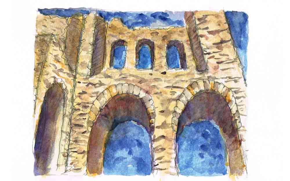
I was inspired by the Craftsy course taught by Stephanie Bower called Perspective for Sketchers. I learned so much. For example, I hadn't actually thought about how the vertical edges of tall buildings are just another set of converging parallel lines when viewed from below, in a worm's eye view. Like in these castle ruins, those tall turret edges seem to lean into one another in the sky adding to that feeling of their height. By the way, if you are getting started with adding perspective to your drawings, this might be helpful.

I love these sort of discoveries. It's one of the reasons I took up drawing. Funny how you can look at something without really seeing it. Sit down and try to draw that thing and you will see so much more of it. Try it, please. You might be amazed at how much appreciating these tiny details in the world around us adds to our every day lives.
Being able to add perspective to your drawings instantly adds a touch of realism and invites the viewer into your picture. But when you are starting out, learning about perspective can seem terribly daunting.
Here are 7 things you need to know about drawing in perspective that might help.

I have recently discovered Craftsy. Well, its not that I didn't know about it before. I did know of it, but given my online art class addiction I had been avoiding heading over and browsing the classes. Because this, for me, is fatal. While procrastibrowsing last week, I happened upon the Crafty drawing classes and found a few on sketching. I'm always interested in learning a bit more about drawing so before long I found myself enrolled in a couple of sketching classes. Big thumbs up for Craftsy classes, by the way. All very professional and yet affordable.
Anyway, one of my favourites has been 'Sketching in Perspective' by Stephanie Bower. Stephanie is delightful and her beautiful watercolour sketches inspired me to spend the month trying to make some of my own.

My series for this month will be done in my Moleskine watercolour notebook. They call this the 'large'. Not sure that is what I would call it as it is only 21cm by 13cm. However, I am finding that is rather a nice size. I worked small last month and concluded that was good on many levels. Time and confidence building, for example. I like the feel of the paper in this moleskine and it is good for a watercolour wash or two but certainly is not the sort of paper you might be used to for larger watercolour work. It is still a sketchbook, after all I suppose.
The supplies for this month are then:
Armed with clear instructions from Stephanie I set about making a pencil sketch of a simple elevation view of a door. This was one of Stephanie's first assignments in the class. I chose a cute little cottage rather than some sort of grand architecture. Felt more forgiving somehow.

Once the sketch was completed it was time for the fun part ... colour! Really this is like making your own colouring book and then getting to fill it in with juicy paint.

Stephanie's sketches are all rather sophisticated. Mine seem to all turn out with a touch of the cartoon about them. I think I am okay with that. I am mad for cartoons after all. Here is another one I did.

It is amazing how a little bit of colour brings a wonky little pencil sketch to life. I do hope you will try it. It is easier than I thought it would be.
Give it a go.... you might just discover your inner urban sketcher...

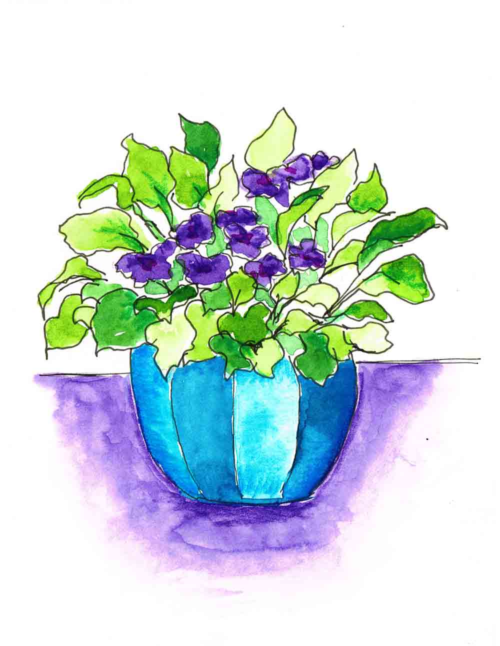
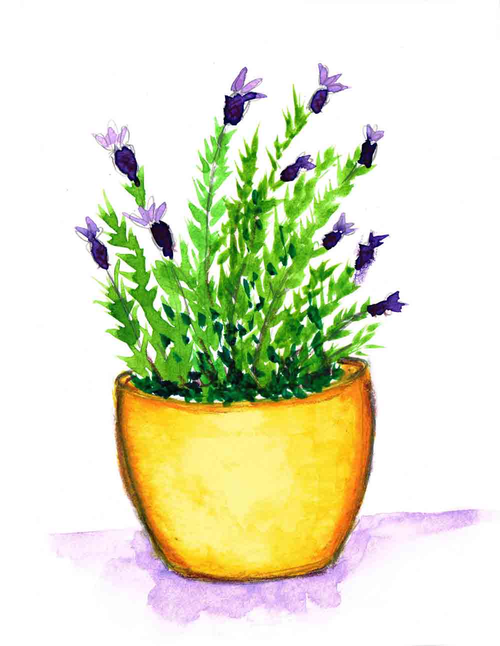
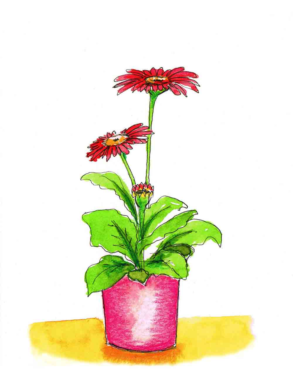
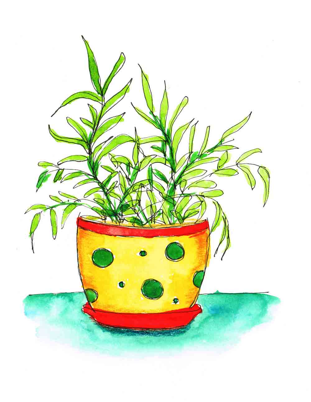
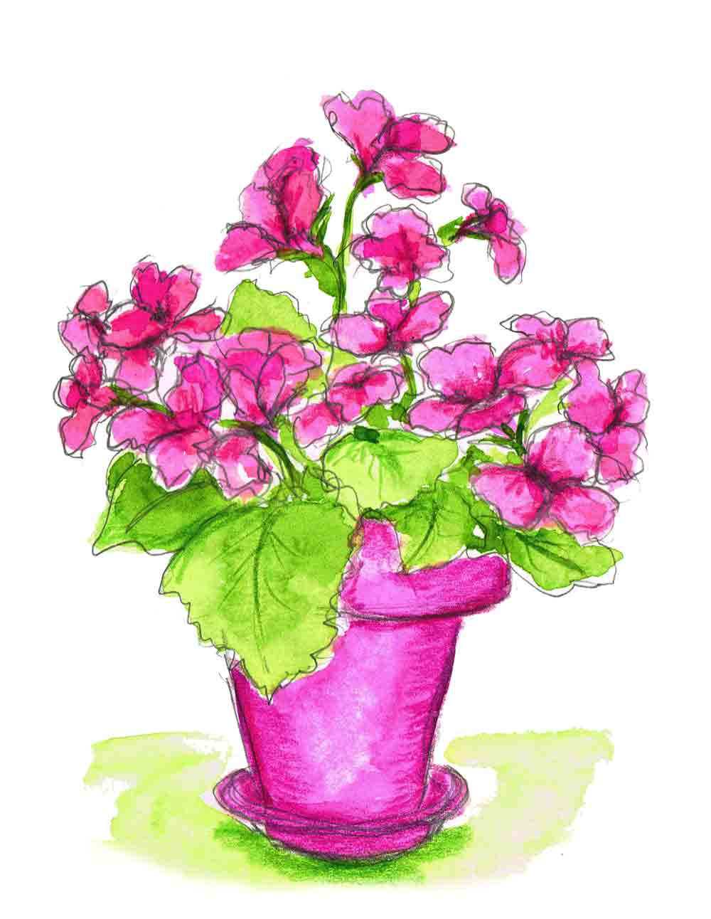
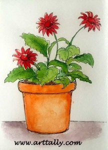
Drawing plants in pots has made for a really enjoyable little series. I think 'little' is part of the reason it was so enjoyable. Scaling down your task into something manageable makes it far more approachable. Also, as we all know, it is one of the rules of the universe that small things are cute. Like this funky pot for instance...

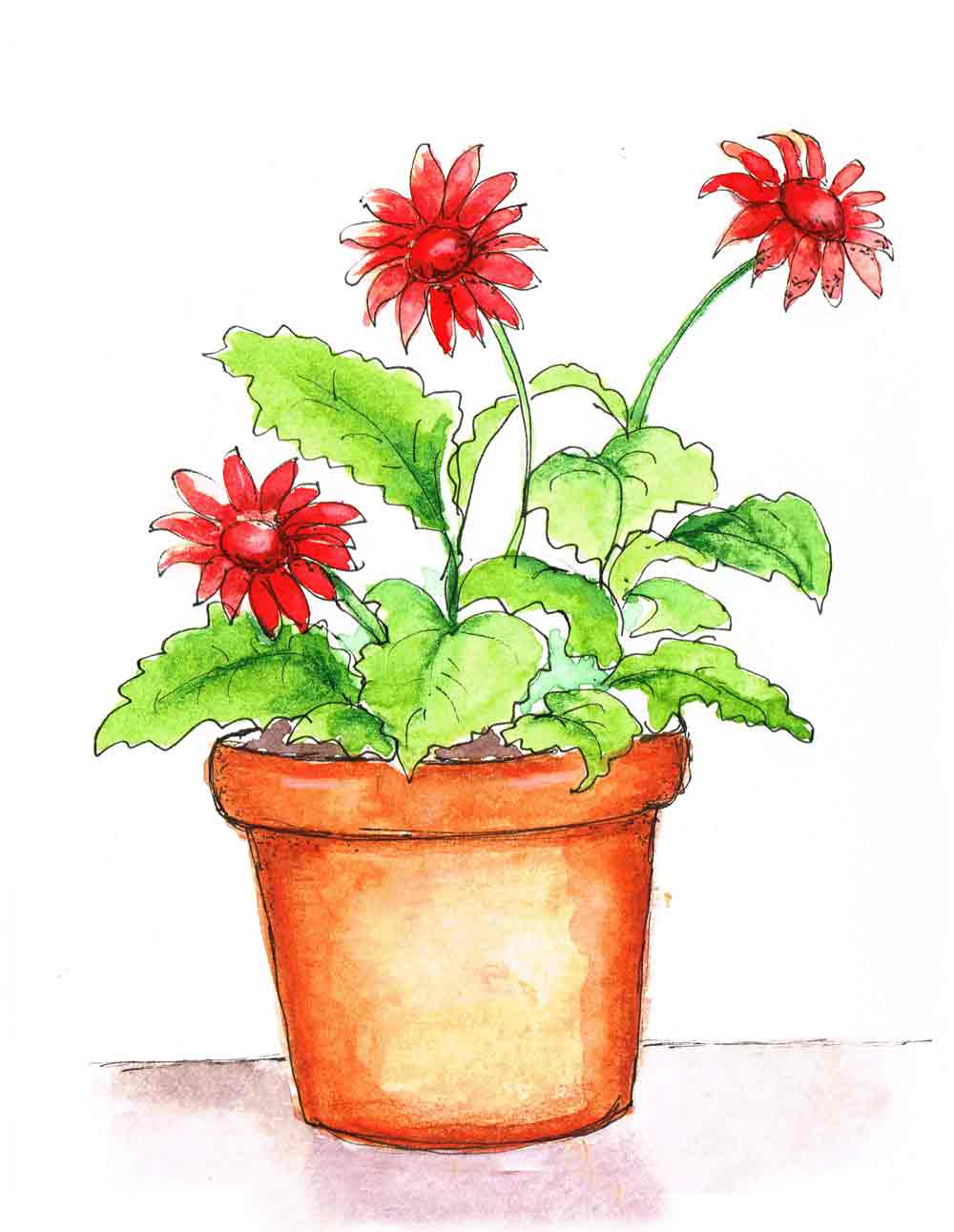
Within the parameters I set for myself this month (small watercolour illustrations of plants in pots) I did have some room to experiment. Most of the time I started with a complete pencil sketch. Often I added an outline in pen - this gerbera for example.

The cartoonist in me likes the pen. But sometimes it doesn't feel right, in which case sticking to pencil seems better. These geraniums feel so loose and abundant - I couldn't possibly trap them in a harsh ink outline.
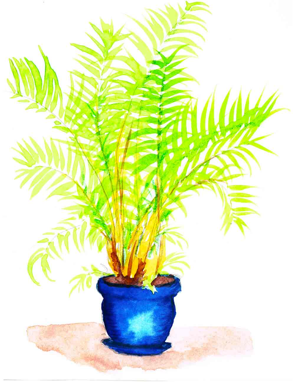
By the middle of the month, obviously on a day when I was feeling bold, I painted rather than drew most of the plant. It can feel a bit scary sometimes to go straight onto the page with a charged paintbrush. But the golden cane palm has fronds which are far more easily achieved by a brush than a sketch. I put in light pencil lines to indicate where the central rib of the palm frond would be. Then I let my lovely springy Chinese brush do the rest of the work.
This brush took a bit of getting used to, but I must admit it is one I keep coming back to. Apparently it is made of weasel hair. Hmm. Not sure what I think of that. But it is a lovely brush. It's the smallest in this set, if you were wondering.
Drawing a cactus was great fun. I am pondering an entire cactus series. When it came to the spikes for that I decided to get out one of my coloured Sakura Micron Pens. They are available in quite a few colours - not just black. For the cactus I used the sepia cone.

There is a surprising array of foliage that you can draw in potted plants. It is a chance to practice adding textures on a tiny scale. Take this bonsai. They are very textured things, bonsais, so do them justice I used pen scumbling (that's scribbles to you and me) for the gnarly trunk and a stiff spiky brush to dab in leaves. Of course it sits in a porcelain dish, so that offers a chance to suggest the smooth shiny surface by paying attention to the light and shading.

I also abandoned my paint set entirely for a couple of the illustrations and drew directly onto the page with my beloved tombow markers. I love their bold colour. I could have activated them with water to give the variation that we associate with regular watercolour. I didn't do that, probably because they were so small.
I was drawing fuschias which are quite complex blooms and that is what made me think of using markers in the first place. While trying to draw these complicated little beauties I was wondering how in the world I would manage to add the colour with a paintbrush. The brush tip tombows seemed the perfect solution since you can effectively do the drawing and the painting simultaneously. Hurrah!

I did miss the effect that the water brings so I only did two paintings like this and then returned to my lovely Schmincke watercolours. How wonderful to be spoilt for choice.
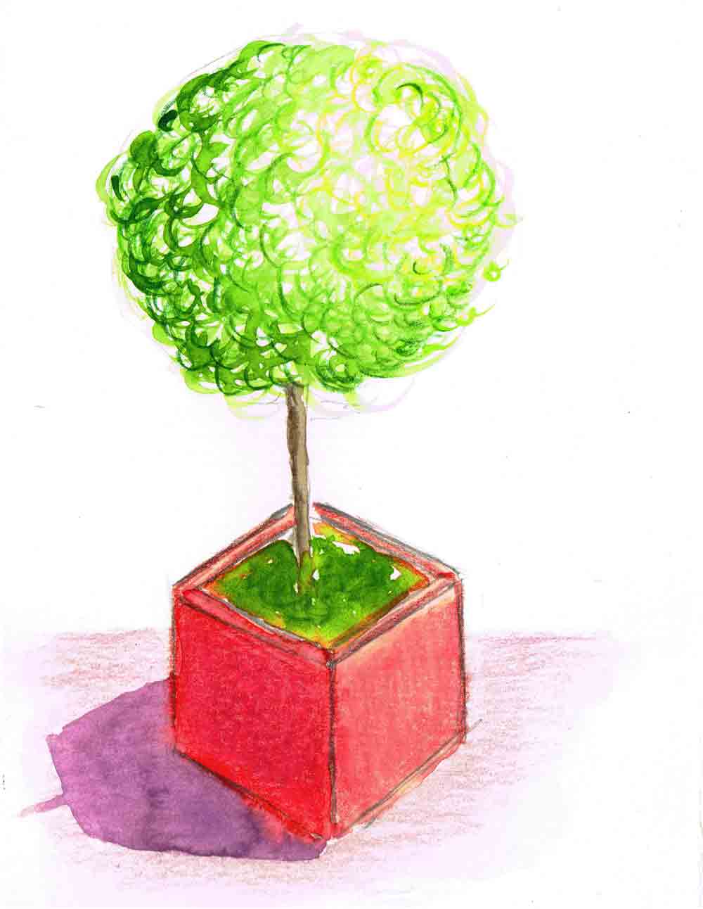
The final potted plant in my series was this little topiary. Spheres are fun to shade. So are square pots. And the long shadow cast by a setting sun seemed an apt conclusion to the full series.

Which one is your favourite?
See more plant paintings in the shop.
Recently I have been drawing more plants in pots in my sketchbook… want to see?
One of these might be just what you are looking for.
Looking for affordable watercolour paints that deliver professional results? Aren’t we all!
I just received a Meilang set of 36 Watercolour Tubes to review. I’ve been very curious to see how they compare to my existing palette of paints from renowned brands.
I want to know whether investing in expensive paints is truly necessary and I’m hoping to find some substitutes for beloved colours within this affordable set of watercolours.
You too? Well let’s dive in then!
Do we really need to be constantly pushing ourselves outside our comfort zone?
I really don't think so. Watercolour painting has given me the perfect opportunity to play with this idea of comfort zones. What applies to painting applies to life, it seems.
Ever want to paint but just feel too….
tired,
under the weather,
busy?
One of the reasons I chose watercolour as a medium in the first place is because it requires very little in the way of supplies, set up and clean up. Even so, there are times when I simply can’t be asked to get off the couch, painting urges notwithstanding.
I’d say that happens to all of us.
Either way, what’s a busy painter to do?
How about this…
These days watercolour is available in so many different types and forms. I am yet to meet one that I don't like.
If you are looking at getting into watercolour, or considering expanding your collection, here is a round up for you. I have included a description…

Some days you just feel pulled in all directions, don't you? We manage to fit more and more into our lives. The more you do, the more you can do. But there is a cost. We cannot run on full steam every waking moment of the day. This is easy to forget. Especially when you have prioritised everything that you have to do for everyone else. Everything for which you are accountable. The risk is that you end up doing the urgent tasks in favour of the important tasks on your list, as Stephen Covey would say.
We have so many goals, even if we perhaps haven't articulated them as such. But I bet we all can come up with a list that goes something like this:

It goes on and on, doesn't it? And we haven't even started on any work-related to do list. At times like this finding time for a self care practice, like doing something creative can seem hard to justify. But I think that we almost have to. If you don't oil the wheels the machine stops turning. We are those machines. And the self practice rituals that we devise for ourselves are the oil.
These things are important although they do not demand to be heard in the way the urgent tasks do. They are important because they maintain our capacity to function, and because they come from our truest values and desires. Our values and needs - not those of someone else.
If your creative practice soothes your soul and refuels you, can you really afford not to do this? To be fair to ourselves though, we have to make sure that these self care routines are manageable. If you only have ten minutes to spare to be creative, then make it count. Let it be enough.
The fact that you set aside time for yourself is more important than the amount of time you allot. Make those few minutes precious and sacred. Not negotiable. Surrender yourself entirely to your practice, whatever it may be. A few minutes with a colouring book. A cup of tea and a sketchbook. Baking a batch of cookies. Ten minutes of writing in your journal - with or without a prompt. A short walk with your camera. Immerse yourself completely in the process, with no expectations for the outcome. Engage all your senses, breathe deeply.
Let every fibre of your being yield to your task. Let your complete mindful engagement in your task feed your soul. Nurture yourself so that you can replenish your ability to help those who need you.
If you have the creative urge - heed it. A few minutes in each day can add up to a surprising body of work. It is infinitely preferable to leaving that need unmet to grow into resentment. We regret the things we don't do far more than we regret the things we have done.
Let your ten minutes of creation be a reminder that you have the power to create the sort of life experience you desire. Moment by moment. And even if you only have a few moments to spare, it can be enough.
I have noticed that when I first began my monthly series - almost one year ago already (!) I managed to produce more paintings in each series. Sometimes I choose something a bit ambitious that takes more time. Sometimes I do this without due acknowledgement of the time that is available in the month. So this month, in an effort to be more sensible I decided to choose a smaller series. Not smaller in number of course, but each individual painting is smaller. Easier to make one every day. Let's see!
Last month I worked mostly in black and white for my Yoga Values series, so this month I feel like a bit of cheery colour. My subject is plants in pots - a very cute subject to work on. Why not join me? Don't underestimate the joy of producing even a teeny doodle of a plant in a pot on the back of your shopping list or the corner of your daily planner!

Anyway, this is how I am doing it.

I am using watercolour paper, the hot pressed kind. That is the smooth surfaced one. It is 300gsm so it is nice and thick. For watercolour, I generally prefer the cold pressed paper which has a little texture. But this series feels more like little illustrations and the smoother surface is nicer to draw on, in my opinion. I have taken sheets from an A4 size pad and cut it into quarters to give me little postcard size paintings of about 4 x 6 inches. (The first sheet I did in an impatient fashion with a lot of clumsy folding and scissors. Then I remembered that I have a paper slicer...)
I start with a quick pencil sketch either graphite or my favourite colerase pencils. Sometimes I go over it in black pen. Feels like making your own colouring book. Other times I will just clean up the graphite sketch a bit and darken up some of the lines. One word of warning - if you do have any lines that you want to erase do it now before you start painting. Once you layer paint over the graphite it is there for good. You can't erase it.

Yay - time for watercolour! A quick spritz of water over the palette and it leaps to life.
If the drawing needs a bit of pizzazz then it is time for coloured pencils. Only when the paint is dry of course. Draw on wet paper and you will be very sad. Often it doesn't take much with the coloured pencils. A little touch here and there to deepen colour in some areas, or add shadow or definition is all you probably need.

How fun is that?
I even made my first video for you! The fourth in the series is a little lemon tree. This time I added the pen after the colour for a looser more whimsical effect.
[embed]https://vimeo.com/161726464[/embed]
Now... please join my creativity crusade by sharing this with the budding artist/reluctant creator you know. There should be some handy buttons over on the left.
If I can do it, we all can, I promise!
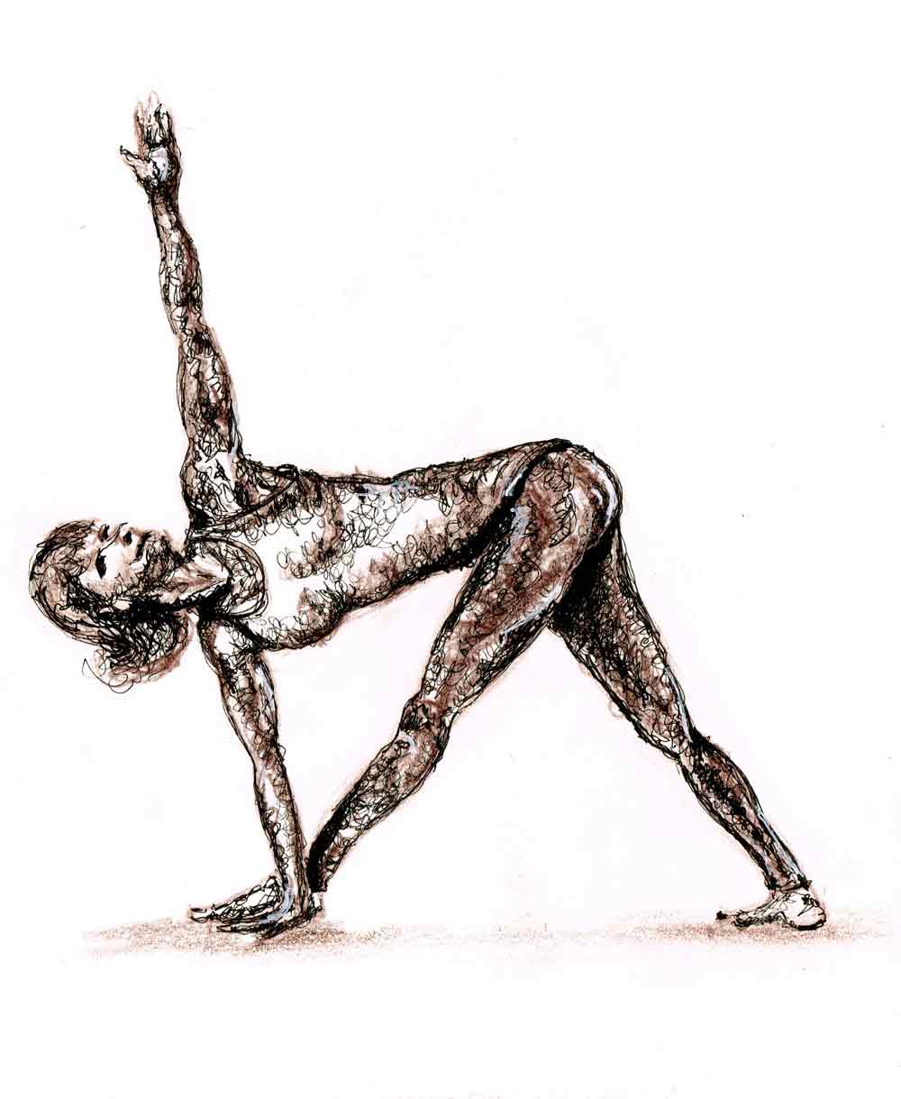
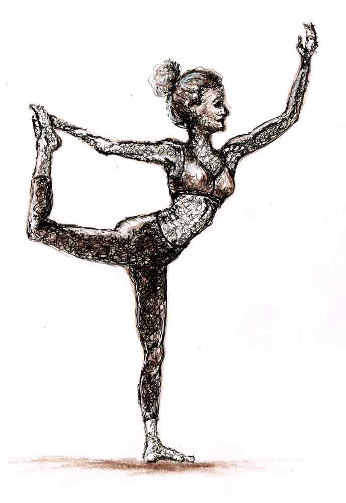
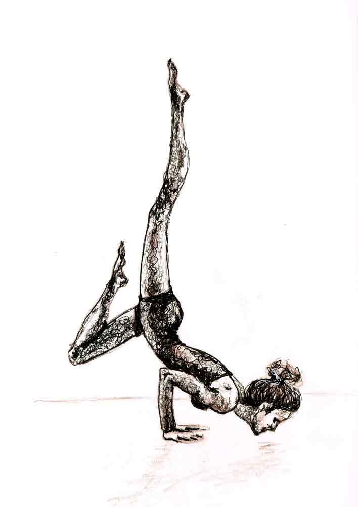

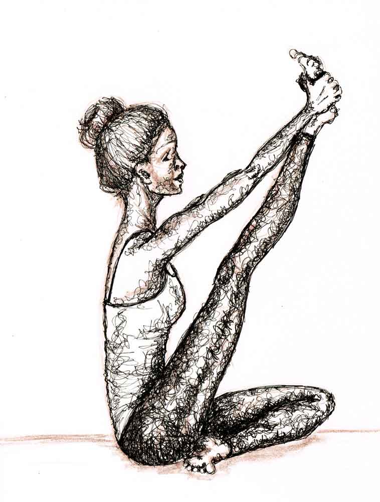
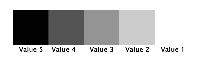
This month I have been drawing yoga poses. A great way to practice figure drawing. And since I recently took a lovely class on Scribble Art with Julie Johnson, I have also been practicing putting in my values with scribbles.

It has been a fun series to do. Quite challenging, given that it is figure drawing in fairly complicated poses, but that is why I wanted to do it in the first place. That and the chance to do some scribbly values. Because those are just fun.
Values are... well very valuable in your arty arsenal. It is the values that can bring mood to what you draw. More importantly they also indicate form, changing a flat image into something more dimensional.

One ends up doing a lot of squinting while trying to put in the values. When you squeeze your eyelids together you reduce the amount of information that your eye can take in. You are left with what is important - the values.
Value is the darkness or lightness of a colour. In a monochromatic image you rely mostly on value to identify what the image represents.

I am finding that it takes quite a lot of practice to be able to see all the values and replicate them in your own drawing. The advice is often to use a value scale. Something like this:
Want to try it?
Take out your smart phone and take a quick photo.
Now use your phone camera or something like the Snapseed app to change the photo into a black and white image.
See if you can pick out each of the values from the value scale in your photo. It can be deceptive. Sometimes an area looks like it is darker or lighter than it actually is because of the value that is beside it. It's one of those tricks our eyes play on us.

I put in the value using scribble, but it can be done with all sorts of techniques like shading, linework and cross-hatching. The paper is white so one of the tricks is to avoid scribbling in the areas that are going to be closest to the first value in the scale (white).
Then the finest pen you have will make a lighter value scribble, while a thicker nib pen will make a darker value scribble. The more dense the scribble is, the darker the value and the more open and lacy the scribble, the lighter the value will appear.
If you go too far you might have to get out a white pen and do a bit of white scribble to lighten up a value.
It’s all rather fun. And by the way, if you are really serious, you can use a wider value scale - 10 instead of 5.
I kept my yoga values series close to being monochromatic to keep things simple. Actually I had planned to make sure it was just black pen in various nib thicknesses.
However, I don't seem to have managed to muster up sufficient restraint to keep it at that. I couldn’t help adding in a bit of coloured pencil here and there. But in the end I stuck to just the chocolate brown colerase pencil - one of my favourite things to draw with - and the pen.

Note: this post may contain affiliate links. If you end up making a purchase through one of these links it is theoretically possible that I may earn a small commission. So, thank you, if that is you!
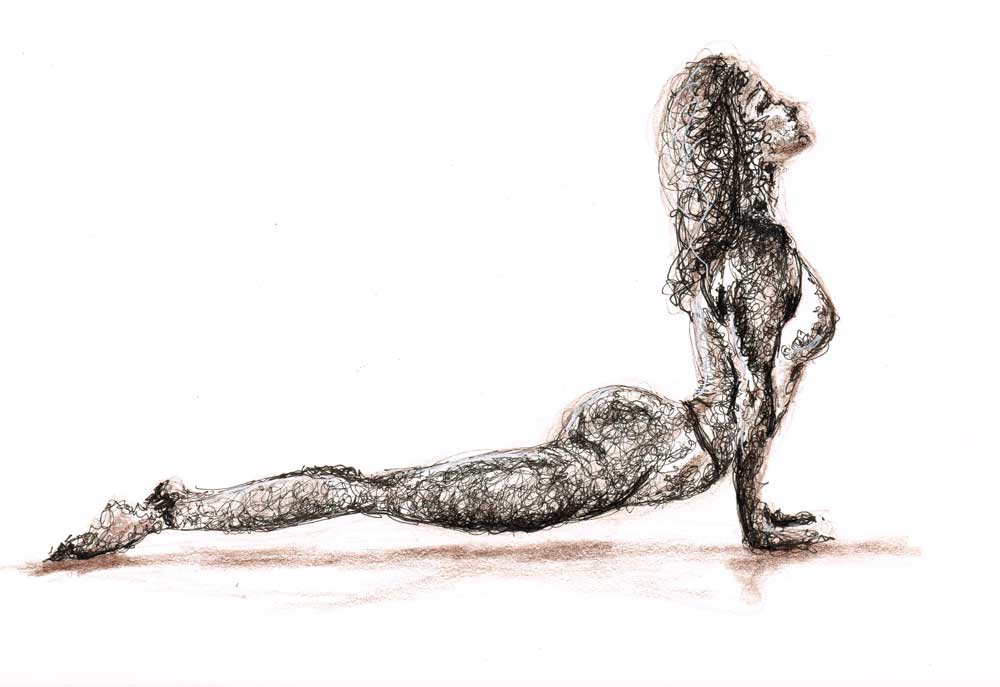
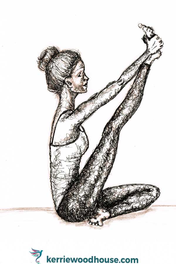
Yoga Values No 3 Upward Dog arttally
This month I am drawing value studies in pen. I have chosen yoga poses as my subject because I love drawing figures and I am a something of a new convert to yoga.
I took a course with the lovely Julie Johnson over at the Jeanne Oliver Creative Network (a place of many lovely art classes, if you are looking...). This course is entitled Scribble Art, and was a marvellously fun way to study and practice the all important values. Here is the first one I did, Tree Pose.
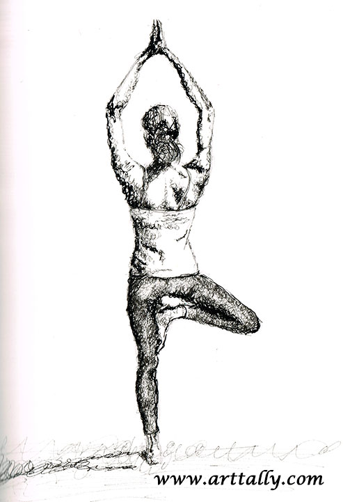
Yoga Values No 1 Tree Pose arttally
I loved using loose and messy scribble to bring form to this figure in a pose that is known for bringing stillness. Rather apt, it seemed. We take our messy, scribbly jumble of thoughts and emotions into yoga class, and hopefully leave with a little more stillness and calm.
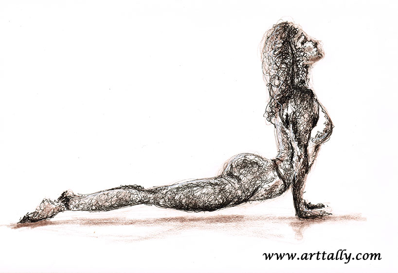
The second pose I tried was Warrior III. Somehow I couldn't help but add a little bit of coloured pencil. I had originally thought that I would leave these black and white - just pen and paper. But the muse suggested some subtle colour. Who am I to refuse?

Yoga Values No 2 Warrior 3 arttally
The third pose I tried is Upward Dog, shown at the very top of this post. My favourite so far.
Once you set your big goals, there are a few things that have to happen next to make them a reality. One of the most important is persistence. Here are my favourite quotes on persistence to help keep you motivated!

I can't believe I am already at the end of my flower faces series. I have to admit I am tempted to do another month of flower faces because it has been so much fun. But I already have something else in mind, so my series for June will be something a bit different from this. New medium, new surface, new subject. Exciting.
Creating something every day and posting it is certainly a challenge. But a good one. After the first month, I still highly recommend it. Even though my task of creating one flower face in pen and mostly watercolour is a relatively small one, it has still been tricky to fit it in some days.
And I think that is rather the point. Even a comparatively small task is easily squashed out of the day by things that seem urgent. Having promised myself (and you!) that I would post every day has helped me remember that while there are other urgent tasks in my day, this one is still important to me. It deserves its space.
So my project of monthly series continues.
In closing off the last of the flower face posts for this series I would like to share seven of my fave flower quotations. Which is your favourite?
“The earth laughs in flowers.” ― Ralph Waldo Emerson
“Perfumes are the feelings of flowers.” ― Heinrich Heine
“A flower blossoms for its own joy.” ― Oscar Wilde
“Don't let the tall weeds cast a shadow on the beautiful flowers in your garden.” ― Steve Maraboli
"Happiness held is the seed; happiness shared is the flower." ― John Harrigan
"A woman should be like a single flower, not a whole bouquet." ― Anna Held
"When the flower blossoms, the bee will come." ― Srikumar Rao
Explore more of the Flower Faces series or see if you can find your favourite in the shop.


It is an enchanting idea to me that flowers express themselves so clearly that they have become recognised symbols of their own energy. They are, to me, a hopeful representation of the notion that if we could be truly ourselves, without the shroud of our doubts and fears and unobscured by our 'shoulds', that self expression would be effortless and that we would be completely understood.
There is a language, little known, Lovers claim it as their own. Its symbols smile upon the land, Wrought by nature's wondrous hand; And in their silent beauty speak, Of life and joy, to those who seek For Love Divine and sunny hours In the language of the flowers. –The Language of Flowers, London, 1875
We have been attributing meaning to flowers for so very many years that the 'language of flowers' now even has its own name - floriography. Victorians sent coded messages using flower arrangements. For example;
roses symbolise love
daffodils symbolise chivalry
lilies symbolise beauty
daisies symbolise purity and innocence
gerberas symbolise cheerfulness
The colour of the flower conveys meaning too.
red - passion and love
orange - expansion, growth, and warmth
yellow - clarity, truth and intellect
green - renewal, growth, hope, health and youth
blue - dreams, inspiration, tranquility
indigo - emotions, depth, intuition and expressive moods
violet - royalty, nobility and spirituality
If you are in the mood to explore the language of flowers a little further, Kate Greenaways' Language of Flowers is available to read online for free here. Vanessa Diffenbaugh has a more modern Flower Dictionary as well as a charming novel, The Language of Flowers.
Explore more of the Flower Faces Series or see the rest of the monthly series in the collection.
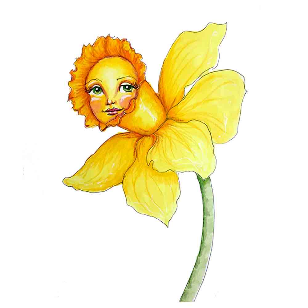
I don't think it is possible to look at daffodils and not think of Wordsworth's poem. I was going to write it out for you, but luckily Jeremy Irons is going to read it to you, most beautifully, instead.
Explore more of the Flower Faces series or see the rest of the monthly series in the collection.

One of my endless fascinations is the illusion of depth on a flat piece of paper. Being able to perceive distance in an image on a page is what draws us into the world of the image's creator.
My analytical side is intrigued by the techniques we can learn to create the illusion of three dimensions. Ok, I have to admit I kind of love that even something as mystical as art boils down to maths in places.
The fact that drawing perspective does involve a step towards maths is probably what puts many of us off learning. I think the trick is to sidle up to it... surreptitiously. Ease gently in, nothing too scary. My introduction was really in Danielle Donaldson's class Creative Girls - a good beginning!
If you are starting out with drawing perspective, here are three things to think about that will help to offer the illusion of depth and distance.
This is a safe place to begin - all about colour. Warm colours (red, orange, yellow) appear to push forward from the paper, while cool colours (blues and greens) recede into the paper. How fascinating it is that this is the way the brain interprets these colours. So one of the easiest ways to suggest a sense of distance is to graduate colours you use from warm ones in the sections of the image closest through to cooler ones in the sections of the image intended to appear further away. Just like my row of little flower ladies...
The other thing that the brain does in interpreting information from the eye is to recognise smaller versions of similar items as being further away, relative to their larger counterparts. So even though all my little flower ladies are about the same size, the ones intended to appear close to the viewer are larger and further apart from each other. Their size and spacing diminish gradually to suggest to the viewer that they are more distant. If you were to draw a line across the tops of the heads of the flowers and extend it out beyond the tiny blue flower and another similar line across the bottom of their stalks, these lines would intersect at one point out beyond the right hand side of the image. Accordingly, this is referred to as one point perspective.
As amazing as our eyes are, we can only see the finest details close up. As we look further into the distance our ability to perceive small distinct details decreases. On a piece of paper, we can mimic this by reducing the level of fine detail progressively from the parts of the image intended to look like they are nearest to us to the parts of the image that are intended to appear further away. Compare the level of facial details on the little red flower at the front of the row to the blue one at the end of the row in Flower Faces no 18 to see what I mean.
Learning to solve puzzles like how to make a flat piece of paper seem three dimensional is an intriguing pastime. If you end up hooked like me then you will be wanting to know a bit more. I am reading a terrific book by Phil Metzger called The Art of Perspective which I am finding to be very helpful. It is not a dry collection of rules and is more like a series of annotated pictures. Phil has a sense of humour and offers step by step instructions of things to try out. Give it a go!
Explore more of the Flower Faces series or see the rest of the monthly series in the collection.

The lotus is a mystical, ancient flower. It is native to Asia and Australia, and it is no ordinary plant. It seems to have super powers most other plants do not.
For example, the lotus is able to regulate the temperature of its flowers much like warm blooded animals regulate their body temperature. The lotus plant can live for a thousand years. The seeds are also remarkable. A lotus seed that was approximately 1300 years old was successfully germinated in 1994.
It is small wonder that it is a significant spiritual symbol in multiple cultures. Hindusim, buddhism and the ancient Egyptian civilisation all associate the lotus with purity, beauty and enlightenment. While each draws a slightly varied meaning from the lotus there is much similarity in the fundamentals of the underlying association as Dean Ravenscroft explains in this article.
One of the fascinations of the lotus flower is that no matter how murky the pond in which it grows, it always emerges clean and beautiful. Some ancient scholars believed the lotus closed its petals and sank beneath the water at night to rise from the water in the morning. Accordingly, it is sometimes associated with rebirth. In reality, the bloom rises from beneath the surface over a period of three days and then blooms in the sunlight.
The roots of the plant are in the pond bed, the leaves float on the surface, and large strong stems raise the blooms several centimetres above the surface of the water. The plant can grow very large - from 1.5 to 5 metres tall and 3 metres wide. Some lotus flowers can be 20cm in diameter.
The lotus also has more practical uses beyond its symbolic, spiritual value. All of the plant is edible, leaves, flowers, stems, seeds. In traditional Chinese medicine, eight separate parts of the lotus flower are used for a variety of ailments, especially those relating to fevers, irritability and bleeding.
The lotus appears in different colours. In Buddhism, each colour carries a different symbolic meaning:
By now, you might be wanting to grow and care for a lotus flower of your own. If so, you will probably want to head over here for some helpful tips. But if that sounds like too much hard work.... you probably just want to look at some photos of beautiful lotus flowers... try this instead.
Explore more of the Flower Faces series or see the rest of the monthly series in the collection.

Today, two flower faces appeared on the page. They seem to understand each other. They remind me to pause and reflect on the value of those things that make our lives worthwhile. Always, these are things that are without price. Like friendship.
Because of these two little flowers I have been musing on friendship today. I would like to share 9 of my favourite quotations about friendship...

Explore the rest of the Flower Faces Series or see if you can find your favourite in the shop.
You know and I know that flowers just make us feel better. Actually, they make us perform better too. You can boost your creativity, productivity and memory by ensuring that your environment contains plants.

At the Chelsea Flower Show in 2013, the Identity Realisation research group at the University of Exeter carried out 90 experiments in association with Indoor Garden Design. Results from the 350 participants that took part in the study show that allowing staff to make design decisions in a workspace enhanced with office plants can increase well-being by 47%, increase creativity by 45% and increase productivity by 38%.
An earlier study by Robert Ulrich found that workers demonstrated more innovative thinking, generated more ideas and came up with more creative solutions to problems in an office environment that included flowers and plants, relative to those in an office with no flowers or plants. And of course, plants and flowers improve the quality of the air in the office which also contributes to the improved well being and productivity of the workers.
In this study by Ulrich, the men generated more ideas than the women when the work environment included flowers. However, the women exhibited greater creativity and contrived more flexible solutions to problems when flowers were present in the environment.
According to Sherry Burton Ways, the integration of plants in offices has been proven to reduce absenteeism and stress levels and lower blood pressure. Other proven benefits include lower noise levels, lower room temperature and reduced humidity.
It would be a mistake to think that design decisions are nothing more than superficial and that decorating your work environment with flowers is frivolous. Scientific studies have repeatedly shown improvement across measures of psychological comfort and business performance in spaces that incorporate natural elements such as plants and flowers.
So get yourself a cheery plant or fresh flowers for your work environment and raise your creativity and productivity. It has to be worth a try, surely?
Explore more of the Flower Faces series


Flowers are designed to get attention. That's probably why we love them. Those bright colours certainly can lift our spirits but they serve a very specific purpose. The point of the flower is to attract pollinators.
Insects, birds and bats are all pollinators. Insect pollinators include ants, bees, beetles, butterflies and moths. Honeybees do more pollinating than any of the other insects. Purple is the bee's favourite colour. (It's mine too. Sensible bees.) Bees are attracted to purple flowers more than any other colour of flower.
The honey bee aims for purple flowers for an excellent reason. Purple flowers contain more nectar than other flowers. So it makes sense that if the bee is genetically primed to seek out purple flowers they have the best chance of survival. It is a symbiotic relationship. Likewise, the flower that has the showiest purple flowers increases its chance of pollination and also improves its chance of survival.
Butterflies prefer bright pink, red, orange and yellow flowers, while hummingbirds are attracted to red, fuschia, pink or purple blooms.
Flowers that bloom at night tend to have less vivid colours. These flowers tend to be pollinated by bats and moths, and there is little sense in their having beautiful colours that won't be seen in the dark. Instead, these flowers are heavily fragrant, using scent to attract their pollinators, rather than colour.
Interestingly, the honey bee doesn't actually see colours in the same way that we humans do. Bees see colours in ultraviolet. Primary colours to the human eye are red, green and blue. But to bees, primary colours are blue, green and ultraviolet. While the studies don't all agree on what the exact colour spectrum is through the eyes of a bee, they all agree that bees cannot see red. To a bee, red is seen as black.
We have been learning about the bee's view of the world from about the early 1900's and the work of Karl von Frisch. If you are looking for more recent investigations of the sensory perception of the bee you might want to start with Lars Chittka from Queen Mary University of London.
But on a more practical note... if you are wondering what colour to paint your hive..... go here!
Explore more of the Flower Faces Series or see the other monthly series in the collection.